.svg)
.png)
.svg)


Designing a voice user interface is not simply a matter of removing buttons. It requires rethinking how a product communicates — replacing visual controls with timing, ambient feedback, and intentional silence.
This is especially true in health and wellness applications, where users may already be managing stress, emotional load, or cognitive fatigue. In that context, every design decision carries extra weight. A cluttered screen, an unexpected interaction pattern, or a missing state indicator can break the sense of safety that the experience is trying to build.
The design principles explored in this article are drawn from real interface work on a voice-first AI assistant feature — originally developed for a mental health application, where the stakes of getting the interaction right are high. The insights apply broadly to any digital product that integrates a conversational AI feature, particularly in the health and wellness space.
Why Mental Health Context Raises the Bar
Most digital products can afford a degree of interface friction. A user who misreads a button or encounters an unexpected loading state in a productivity app is mildly annoyed. A user doing the same thing mid-conversation with a mental health AI assistant is pulled out of a vulnerable moment — and may not come back.
This is the specific challenge of designing voice interfaces for emotional or psychological contexts. The user is not in a transactional state. They are often processing something difficult: anxiety, burnout, a pattern of thinking they are trying to understand. The interface is not just a delivery mechanism — it is part of the therapeutic container.
That means every ambiguous state, every moment of silence without feedback, every jarring transition carries disproportionate weight. An unclear processing indicator does not just confuse the user — it introduces doubt at exactly the wrong moment. A summary screen that ends abruptly can leave someone feeling dismissed rather than supported.
The same principles that make a voice UI feel polished in a general context become load-bearing in a mental health context. Calm visual behaviour, predictable state changes, and a sense of closure at the end of a session are not nice-to-haves. They are part of how the product communicates that it is safe to use.
These stakes are most acute in mental health applications, but they apply more broadly to any health product where users may be managing chronic conditions, navigating difficult diagnoses, or simply arriving in a state of stress. The sensitivity of the context should inform the precision of the design.
Why Voice Interfaces Demand a Different Design Logic
- In a traditional UI, the interface speaks for itself. Buttons, labels, and navigation patterns tell the user what to do next. In a voice interface, the product's job is to get out of the way.
- Users speaking to an AI assistant are in a different cognitive mode. They are not browsing or deciding — they are talking. Any visual element that demands attention or action pulls them out of that mode.
This means voice UI design must accomplish something counterintuitive: it must provide clear, reassuring feedback without ever asking the user to look at the screen.
Designing for States, Not Screens
The most important principle in voice UI design is that the interface must communicate system state in real time — clearly, calmly, and without interruption.

In most health app contexts, a voice interaction session has at least four distinct states that require different visual treatment:
- Listening: The system is receiving audio. The user is speaking.
- Processing: The system has received input and is working on it. The user knows to wait.
- Responding: The AI is speaking. The user is receiving information.
- Idle / Ready: The session is open but no exchange is actively happening.
Each of these states should feel distinct. If the listening state and the processing state look the same, users interpret silence as failure. If the processing state and the responding state are visually similar, users may not realise the system has finished thinking and started speaking.
Getting these distinctions right is what separates a voice interface that feels intelligent from one that feels broken.
What This Looks Like in Practice
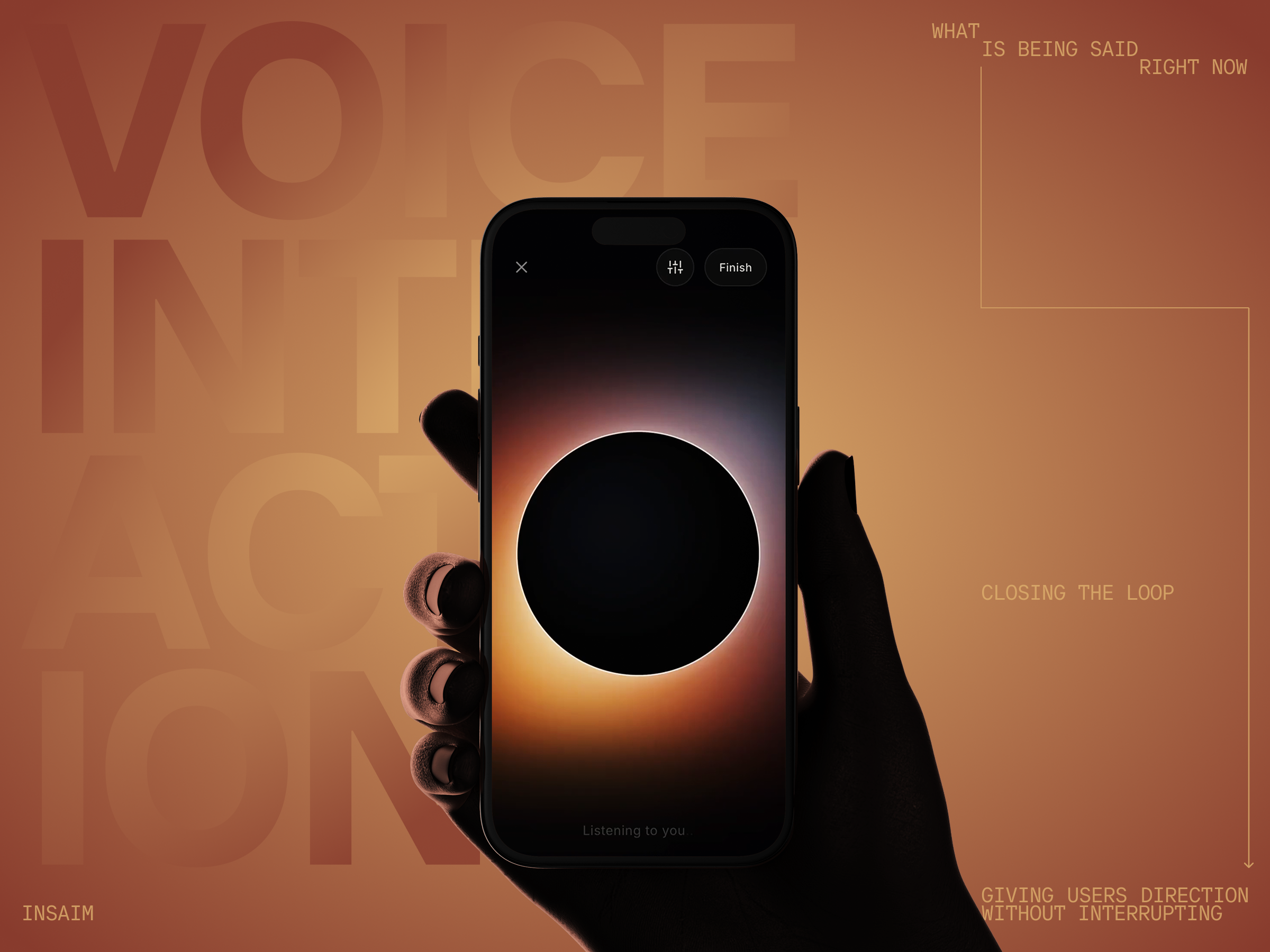
The screens below show how we approached this in a voice-first AI assistant interface designed for a mental health application. They cover all four interaction states across a single session flow, from the moment the user begins speaking through to the post-conversation summary.
Based on this example we will show how abstract principles — state clarity, minimal controls, ambient feedback, meaningful closure — can be resolved into a coherent visual system. The decisions are specific to this product's context. The problems they solve are not.
The rest of this article unpacks those problems and the range of ways a design team might approach them.
Using Visual Metaphor to Carry State
The principle is straightforward: a single ambient visual element — a shape, a light source, a glow — can carry all four interaction states if it is designed to change in ways that feel intuitive rather than arbitrary. The implementation, however, is where teams diverge significantly.
Rather than using text labels or status indicators, the design uses a single luminous circle whose light behaves differently in each state. During listening, the glow sits at the outer edge of the circle — exterior, receptive, open. During processing, it migrates inward. When the AI responds, the light source moves fully inside the shape.
This is not purely aesthetic. The spatial logic carries meaning: what was outside (the user's words) has moved inside (the system's understanding). Users do not need to read a label to know the system has shifted from receiving to thinking to speaking. The change is felt before it is interpreted.
The specific metaphor — exterior versus interior light — is one solution to the state communication problem, not the only one. What matters is that whatever visual language a team chooses maps consistently and intuitively to the states it represents. Arbitrary animation or decoration that does not track state is worse than no feedback at all.
Minimising Friction: The Case Against Buttons
A voice interface that still requires button presses to start or stop speaking is not truly a voice interface. It is a push-to-talk radio.
In applications designed around natural conversation — particularly those in the mental health or emotional support space — the absence of interaction friction is part of the product experience. The user should feel as though they are talking to someone, not operating a device.
This means removing tap-to-speak buttons from the primary interaction flow. The session should open into a listening state automatically. Interruptions can be handled through voice rather than touch — in our interface, this is surfaced as a quiet "Speak to interrupt" prompt, keeping the hands-free experience intact without leaving the user without an escape route.
The only controls that belong in a voice session UI are the ones that govern the session itself rather than the conversation: an exit, a settings shortcut, and a way to end the session. These sit at the edges of the screen — present when needed, invisible when the user is in the flow of speaking.
Showing Only What Is Being Said Right Now
When the AI responds, there is a temptation to display the full response as text — either as it streams in, or as a complete block once it arrives. This is usually a mistake.
In a voice interaction, text is a secondary channel. It can support comprehension, but it should not compete with the spoken response. Displaying too much text forces the user to split attention between listening and reading, which breaks the conversational quality of the interaction.
A better approach is to show only what the AI is saying at this moment — a single sentence or phrase, updated in real time as the response progresses. This creates the impression of a living conversation rather than a transcript feed.
This restraint is also better for accessibility and for users who are in emotionally charged states. Dense text in a health context can feel clinical or overwhelming. Short, present-tense phrases feel like a conversation.
Giving Users Direction Without Interrupting
One feature that adds meaningful value to AI voice sessions is the ability for the user to steer the conversation before it happens.
Rather than waiting to see where an interaction goes, users can pre-select the mode of engagement. The value is not in giving users unlimited control but in offering a small number of meaningful directions — enough to feel heard, not so many that the choice itself becomes a burden.
In our interface, this takes the form of a compact modal triggered from a settings icon in the session header. Options like "Suggest next steps," "Challenge me," "Soothe me," and "See it differently" give the user four clearly distinct conversational modes. None of them require explanation — the labels do the work.
This pattern does not have to look exactly like this to be effective. A swipe gesture, a pre-session setup screen, or a floating prompt between turns could serve the same function. The underlying principle is user agency: the conversation should be able to adapt to what the user needs, not just what the AI decides to offer.
The Post-Session Summary: Closing the Loop
One pattern that is underused in voice AI products is the post-conversation summary.
After a voice session ends, users are often left with a diffuse sense of what was discussed but no clear takeaways. This is especially true in health and wellness contexts, where the conversation may have surfaced insights, named patterns, or identified next steps.
A good post-session summary does three things:
- It briefly captures what the conversation covered. A short paragraph in plain language — not bullet points — that reflects the session back to the user.
- It names any cognitive or behavioural patterns that emerged. In a mental health context, this might include thinking traps, recurring beliefs, or emotional themes. In other health contexts, it might surface patterns around sleep, energy, or adherence.
- It gives the user a short, practical next step. Not a prescription — just a suggestion that helps the interaction feel purposeful rather than just pleasant.
The summary screen is also the right place to offer the user two simple choices: return to continue the conversation, or close and return to the main app. This prevents the session from ending abruptly and gives the user a sense of completion.
The most important thing we needed to show was how the system reacts to the data — speaking, listening, processing — all as clearly separate states. We wanted to create the impression that you are talking on the phone with someone alive. No unnecessary tapping, no friction. Just conversation. The goal is not to build a feature. It is to create the feeling of presence.
Synthesising the Principles: A Framework for Voice UI States
Effective voice user interface design in health apps rests on five foundations:
- State clarity. Every moment in a voice session should have a clearly identifiable visual state. Listening, thinking, and speaking should each feel different.
- Ambient feedback. Use motion, glow, or shape change to communicate state without requiring the user to read anything.
- No unnecessary controls. Remove anything that requires tapping during an active conversation. Keep session controls minimal and peripheral.
- Contextual text display. Show only the current phrase being spoken. Never flood the screen with a full transcript during a live session.
- Meaningful closure. End every session with a short, structured summary that gives the user clarity on what was discussed and what comes next.
Conclusion
Voice user interface design is still a relatively young discipline, and many of its most effective patterns have not yet been standardised. What is clear is that voice UI requires designers to think in time rather than space — in flows, states, and feedback rhythms rather than layouts and components.
In health and wellness applications, this matters more than anywhere else. The interface is not just a delivery mechanism for a feature. It is part of the therapeutic or supportive experience itself. A voice interface that feels calm, intelligent, and present can meaningfully change how a user experiences a difficult conversation with an AI.
The examples and principles in this article represent one approach to that challenge — not a prescriptive framework, but a set of tested ideas worth building on.
FAQ
- What makes a voice user interface different from a chatbot interface?
A chatbot interface is primarily text-based and turn-structured: the user types, the system replies, and the exchange is visible on screen. A voice user interface relies on audio as the primary communication channel. Visual elements play a supporting role — confirming state, providing light context, and surfacing summaries — rather than carrying the conversation. The experience is closer to a phone call than a messaging thread.
- How should a voice UI handle errors or silence?
The worst thing a voice UI can do with silence is nothing. Users need to know the system has not frozen. A distinct processing state — visually different from the listening state — reassures the user that something is happening, even when the system is not yet ready to speak. Errors should be handled gracefully and, where possible, allow the user to simply try again without restarting the session.
- Is visual feedback necessary in a voice-first interface?
Yes. Even when the primary modality is voice, users benefit from ambient visual confirmation of what the system is doing. This is especially true in mobile environments, where users may be glancing at a screen intermittently. Ambient feedback — through motion, shape, or light — provides this reassurance without demanding focused attention.
- How much text should appear during a voice response?
As little as possible. The recommended approach is to display only the phrase currently being spoken, updated in real time. This keeps the visual layer aligned with the audio, avoids information overload, and maintains the conversational quality of the interaction. Full transcripts are better offered as an optional post-session view rather than shown during the session itself.
- How should AI voice interfaces handle emotional or sensitive topics?
With restraint and clarity. The interface should not try to respond to emotional content with emotional visuals — pulsing hearts, colour floods, or dramatic animations. The better approach is calm, consistent visual behaviour that communicates stability. Knowing that the system will not react unpredictably is itself a form of reassurance. Post-session, a thoughtful summary that names what was discussed — without dramatising it — closes the loop appropriately.