.svg)
.png)
.svg)
.svg)
.svg)


A well-designed app menu page does more than just list options — it shapes how users move through your app and how effortlessly they can reach the features they need. From finance tools to travel apps, an intuitive menu reduces friction, highlights key actions, and improves overall engagement. In this article, we’ll share actionable app menu page ideas, show real-life examples, and provide practical guidance from INSAIM Design Studio for creating menus that feel natural.
The Role of a Menu Page in App UX
A menu page serves as the central navigation hub of your app. Done well, it communicates hierarchy and helps users achieve goals without confusion. Done poorly, it can frustrate, hide important features, or leave users guessing where to go next.
When designing a menu page, ask yourself:
- Which features are core to my app’s purpose?
- How do I balance simplicity and discoverability?
- What layouts make interactions intuitive?
Popular Menu Page Layouts
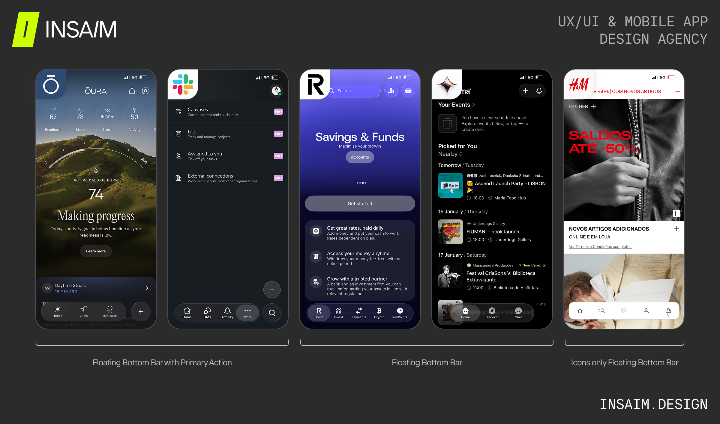
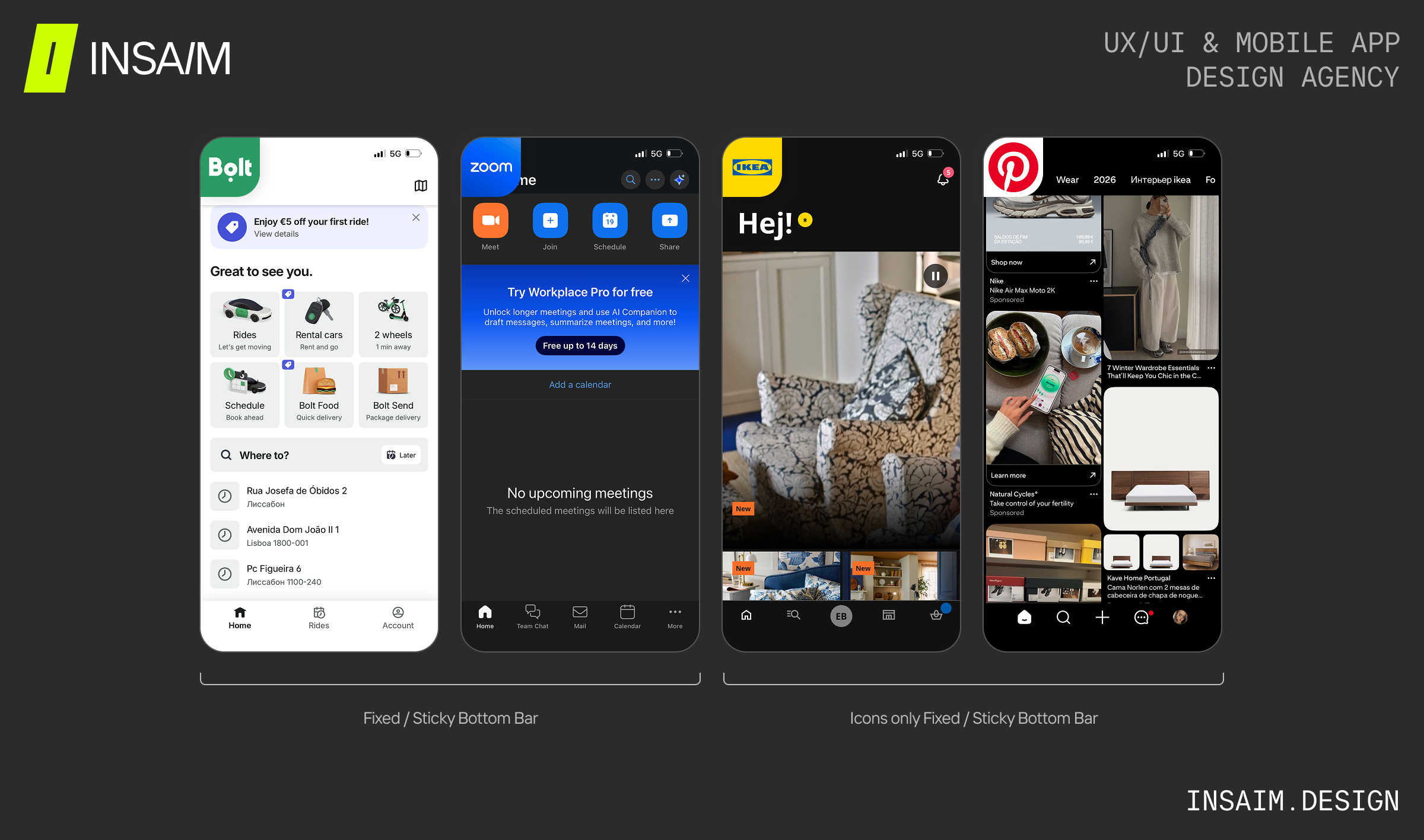
Tab Bar / Bottom Navigation
Bottom navigation is one of the most familiar patterns for mobile apps. It allows users to reach key sections with a single thumb swipe. While its core function remains consistent, the UI design and behavior of the tab bar can vary to suit different app contexts and user needs. Understanding these variations can help you choose the right approach for your app:
- Floating Bottom Bar with Primary Action:
A visually elevated bar that highlights a primary, distinct action, guiding users toward the most important task. Works well in productivity or messaging apps where a single action dominates user behavior. - Floating Bottom Bar:
A single floating bar that maintains accessibility without occupying full screen width. Works well for content-heavy apps like media or lifestyle platforms, creating a sense of openness. - Icons-Only Floating Bottom Bar:
A compact floating bar that displays only icons, providing quick access to key actions while keeping the interface uncluttered. Labels can be optional when the icons are widely recognizable and the app’s functionality is intuitive, making navigation seamless for users in shopping apps, media platforms, or social networks.
- Fixed / Sticky Bottom Bar:
A persistent navigation bar anchored at the bottom of the screen, combining icons with labels to provide clear, always-visible access to key sections. Ideal for apps where users perform high-priority tasks and need uninterrupted access to core functions.
- Icons-Only Fixed / Sticky Bottom Bar:
A streamlined fixed bar that uses only icons, minimizing visual noise. Ideal for apps with familiar actions or when maximizing content space is important.
- Limit to 3–5 main actions.
- Use recognizable icons with short labels.
- Highlight the active section clearly.
Vertical Sidebar / Hamburger Menu
Side menus are ideal for apps with many options or advanced features. They keep the interface clean while still giving access to all actions.
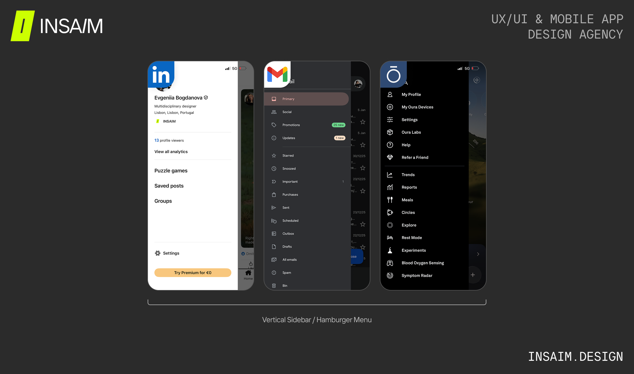
- Organize items by priority.
- Group items logically into clear sections (e.g. Core actions, Management, Settings) to reduce scanning time.
- Keep it persistent across core screens.
Grid or Tile-Based Menus
When your app has visually rich features, a tile-based layout can communicate both hierarchy and content type. Users can scan options quickly and understand at a glance what each action does.
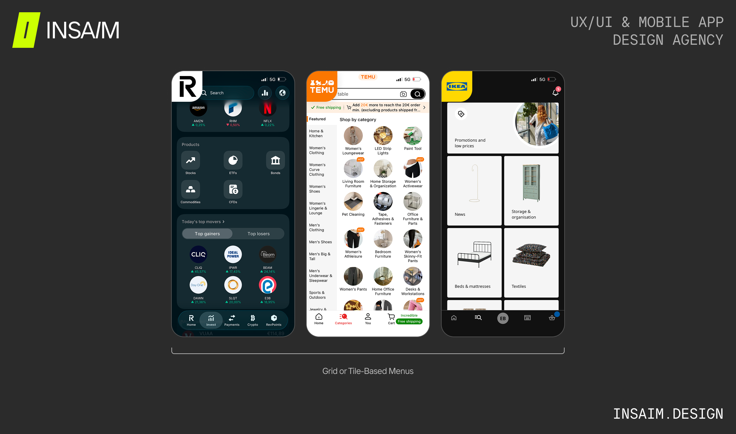
- Respect natural reading patterns (place the most important actions in the top-left or top-center areas).
- Avoid dense content inside tiles — focus on one clear action per tile.
- Plan empty and loading states.
Designing Complex Navigation
Complex apps sometimes need a little extra help to stay easy to use. Here are menu strategies that make even advanced options feel approachable and organized.
- Expandable Submenus: Hide less-used options under collapsible sections to keep the interface tidy.
- Dynamic Sorting: Reorder menu items based on context, like time of day or usage patterns.
- Integrated Search: For apps with many actions, search within the menu speeds up navigation.
Designing for Clarity and Usability
- Consistent Terminology: Use labels that clearly describe each action. Avoid jargon.
- Highlight the Current Location: Users should always know where they are.
- Interactive Feedback: Buttons, icons, and hover states should signal interactivity.
- Accessible Touch Targets: Ensure buttons are large enough for all users.
- Personalization: Consider adapting the menu based on user behavior or preferences.
Takeaways for Designers
- A menu page is the anchor of app navigation. Think about hierarchy, clarity, and usability first.
- Choose a layout that fits the app’s complexity — bottom tabs for simplicity, side menus or tiles for more content-heavy apps.
- Use real examples to inspire decisions, but always prioritize your users’ needs.
- Test the menu with real users to ensure it’s intuitive, fast, and enjoyable.
For designers looking to speed up their workflow and maintain consistency across screens, exploring ready-to-use UI kits and design systems can be a game-changer. Check out our curated guide on Best UI Kits and Design Systems for Mobile Development to discover tools and resources that can inspire your next app menu page and elevate your app interface design.
FAQ
- How many items should a menu contain?
Keep bottom navigation to 3–5 items; side menus can handle 10–12, but always prioritize core features.
- Should app menu items use icons, text, or both?
For optimal usability, combine icons with concise labels. Icons support quick visual recognition, while text ensures clarity — together they improve comprehension and reduce cognitive load for users.
- How to design an app menu page for complex apps?
Designing an app menu page for complex apps requires organizing content clearly and reducing cognitive load. Use expandable submenus to hide less-used options, group items logically by function, and include a search or quick-access feature. Prioritize core actions, provide visual hierarchy with icons and labels, and consider adaptive or dynamic layouts that respond to user behavior. Testing with real users ensures the menu remains intuitive even as features grow.
- What are the best app menu page layouts?
Popular layouts include bottom navigation (tab bars) for simple apps, vertical sidebar/drawer menus for apps with many options, and grid or tile-based menus for visually rich content. Choose the layout that fits your app’s complexity and user goals.
- Where can I find inspiration for app menu UI design?
Look at real product examples across industries like finance, travel, and productivity apps. You can also explore platforms like Mobbin to see real iOS apps in action, studying their menu layouts and navigation patterns to apply app UX best practices.