.svg)
.png)
.svg)


Overview
One of our recent tasks was to evolve the homepage of an enterprise AI platform operating in a complex regulatory environment. The goal was to create a digital presence that reflects the product’s depth and values while remaining clear and approachable for users.
The platform supports teams in structuring and analyzing large volumes of data within demanding workflows. As the product expanded, its visual communication no longer fully expressed the sophistication of its underlying system. The homepage became the starting point for establishing a stronger visual foundation.
Strategic Objective
The redesign needed to address several parallel objectives:
- Communicate product maturity and technical precision
- Support enterprise-level positioning
- Avoid generic AI visual clichés
- Preserve human-centred approach
- Ensure a credible evolution
Industry Context
Rather than redesigning from scratch, we focused on transforming some of the existing visual elements. Many AI products rely on highly futuristic visual languages — neon gradients, abstract 3D forms, and visually expressive technical cues. While visually distinctive, these approaches can feel impersonal or overly mechanical.
The goal was not to appear futuristic, but to feel structured, reliable, and technologically mature.
Strategic Exploration
We explored two structured visual approaches to test different balances between approachability and technological precision. Both directions preserved key elements of the existing identity — particularly rounded forms and color variations — while introducing stronger compositional discipline and system logic.
Approachable, Clear, Systemic
Hypothesis
If complex workflows are presented through calm, structured visuals, the platform will feel reliable and intuitive — even when handling advanced AI processes. This direction emphasizes usability and compositional balance as signals of maturity.
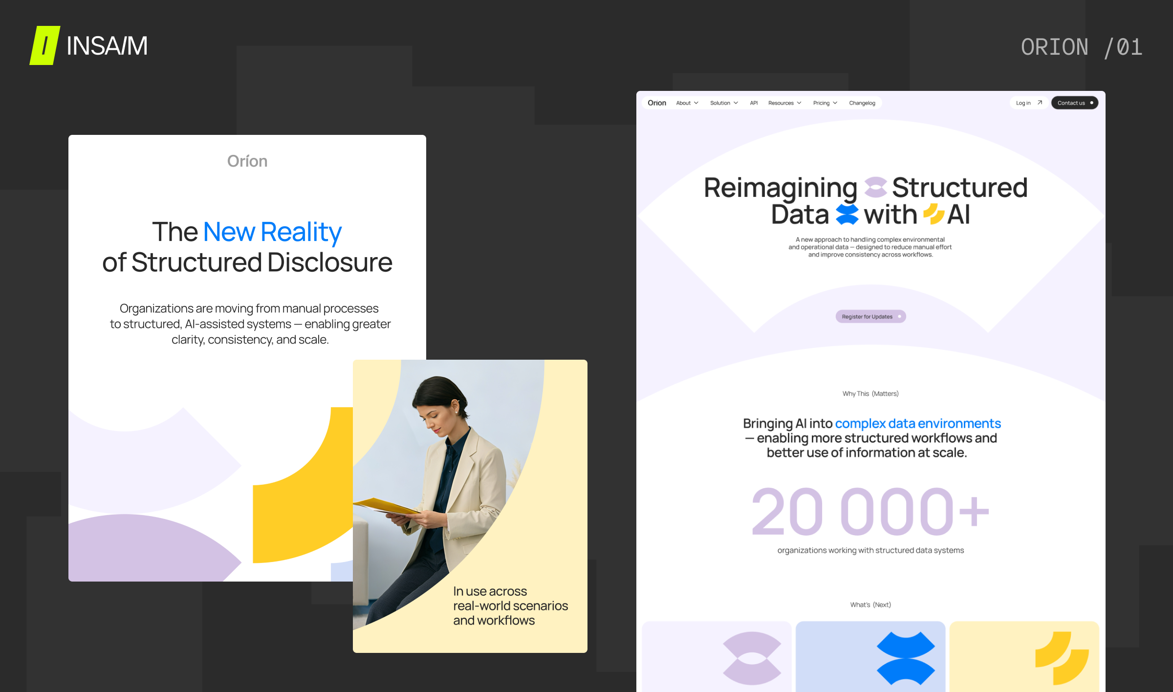
Characteristics
Rounded semi-circular forms derived from the existing logo are combined with clear, modular layouts to create a structured yet flexible visual system. Balanced color combinations — mixing muted and saturated tones — add depth and contrast, while a subtle visual rhythm brings consistency across compositions. This is complemented by modern geometric sans-serif typography, reinforcing a clean and contemporary feel.
This direction explores how enterprise AI can feel: human without losing precision, structured without rigidity, and professional without intimidation.
Color richness is preserved, but refined and organized. Continuity is strengthened through discipline.
- Calm clarity
- Accessible intelligence
- Professional composure
- Structured warmth
Calm, Technological, AI-naitive
Hypothesis
If AI complexity is expressed through precise geometry and controlled gradients, the platform will feel technologically mature and enterprise-ready. Subtle natural imagery in the hero section introduces contextual grounding, preventing the interface from feeling overly abstract or detached.
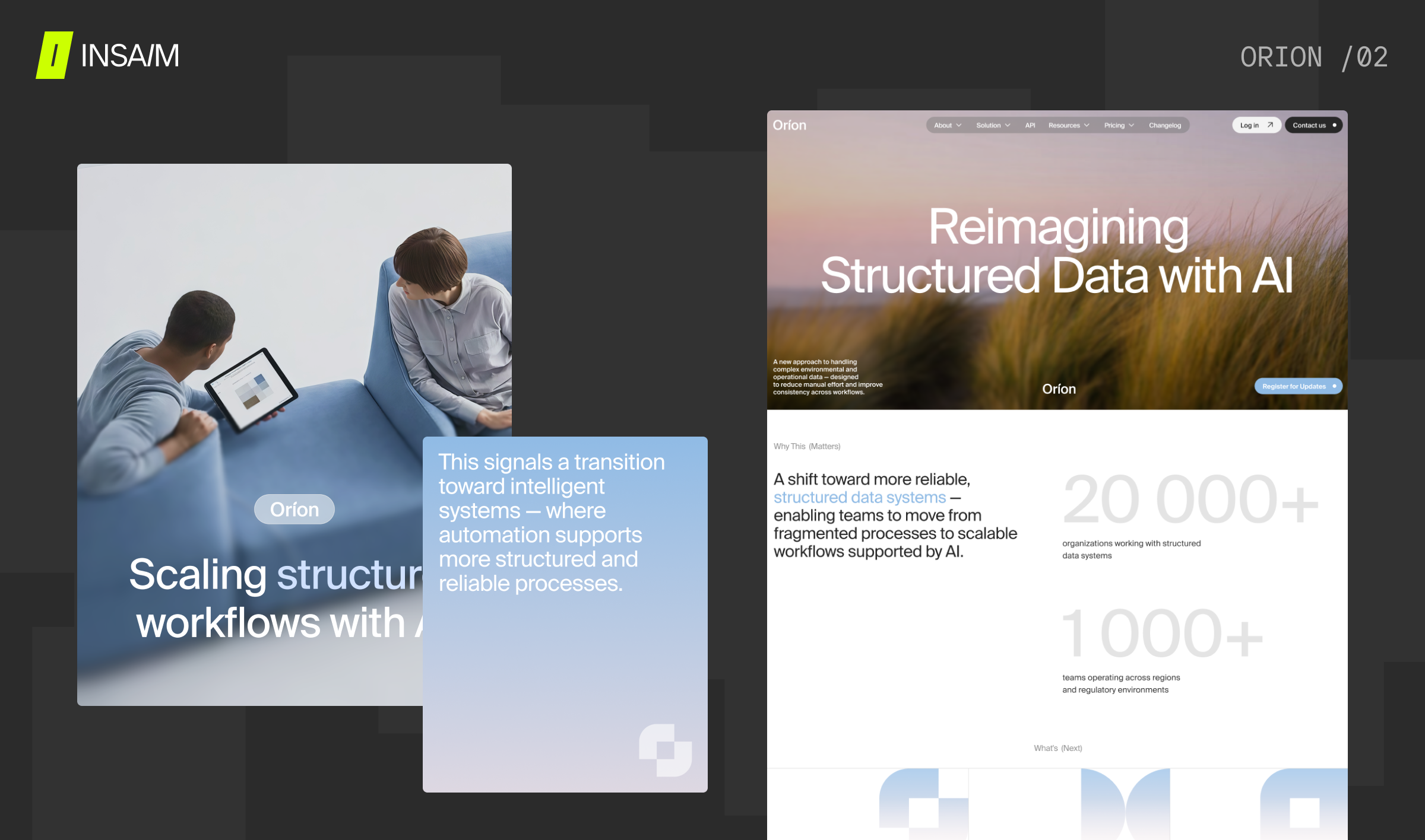
Characteristics
Semi-circular forms combined with square geometry create a balanced and structured foundation, enhanced by transparent overlays and modular compositions that add depth and flexibility. Soft atmospheric gradients — blending blue, pink, and cool tonal shifts — bring a distinct visual mood, while subtle natural imagery in the hero section adds a sense of calm and context. The system is unified by ultra-modern Swiss-inspired grotesque typography, reinforcing a precise and contemporary aesthetic.
This direction builds on the existing visual elements while introducing stronger geometric discipline and spatial control. Gradients introduce dimension without spectacle. Geometry establishes visual logic across layouts.
Soft atmospheric gradients are layered and balanced, creating a calm visual rhythm. Tonal shifts are precise, reinforcing clarity and compositional harmony.
- Calm confidence
- Technological maturity
- Structural clarity
- Quiet authority
Design System Thinking
Both directions were developed as scalable systems rather than isolated homepage concepts. The system was designed to support:
- Homepage storytelling
- Feature-level communication
- Technical documentation
- Integration pages
- Social media assets
- Long-term product expansion
Geometry as a Functional System
- Visual metaphors for data structuring
- Indicators of algorithmic logic
- Modular layout units
- Scalable compositional blocks
Strategic Insights
- Restraint differentiates: Standing out does not require visual intensity.
- Enterprise trust is built through clarity: Structured layouts communicate reliability more effectively than spectacle.
- Complexity must be translated visually: AI workflows become accessible when expressed through modular geometry and hierarchy.
- Creativity operates best within constraints: The exploration was guided by positioning logic and system thinking –– not aesthetics alone.
In a technology landscape often defined by visual futurism, this exploration demonstrates how intelligence can feel calm, structured, and deeply capable — without relying on spectacle.