.svg)
.png)
.svg)


Productlab
Services & Technologies
Deliverables
task
A full brand identity redesign for a product community — translating values into a coherent visual language, and delivering it through a Framer website and brand assets
year
About the project
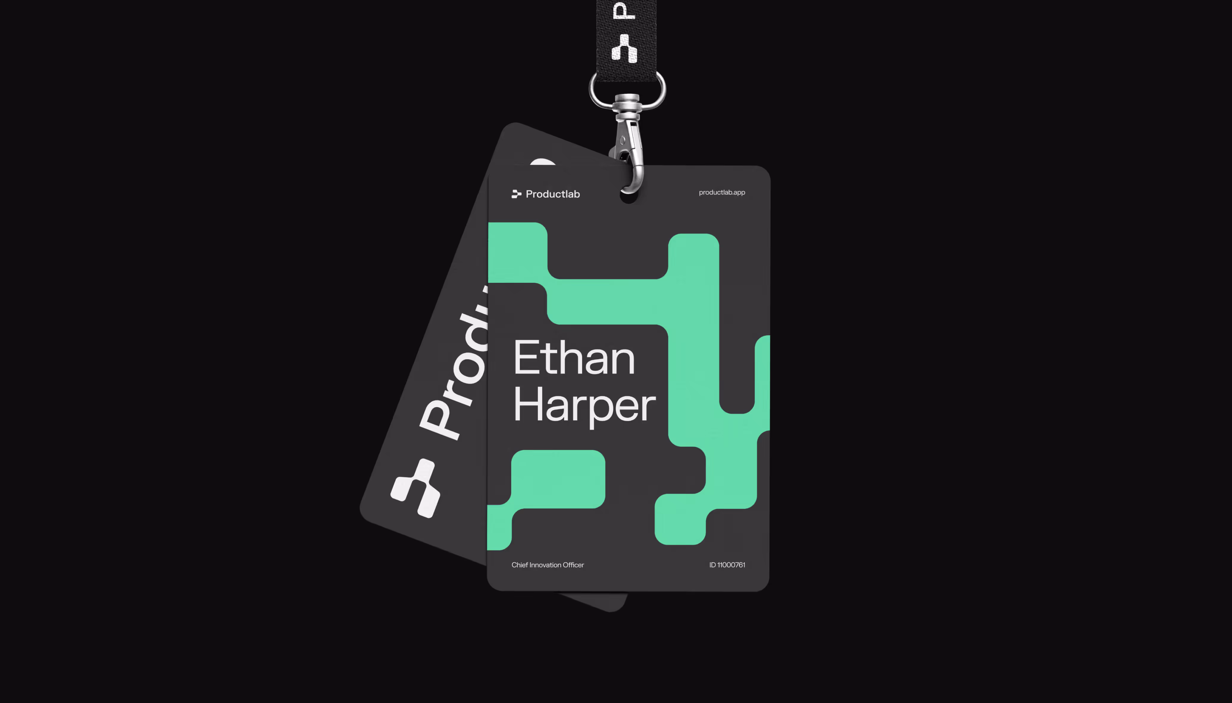
we turned community values into a coherent visual language
Productlab is where people come together — a product community and education platform for founders, leaders, and builders. They came to us with no existing visual language and a clear goal: a brand that would capture the company's values and hold up across every touchpoint. We built the identity from scratch, developed a full set of brand assets, designed the website, and brought it to life in Framer.
Team involved

Artem
Artem

Julia
Julia

Artem
Artem
About the client
Productlab is a community and a conference for product managers and product builders. The company offers offline conferences, hands-on workshops, leadership programs, and executive coaching to foster professional growth and connection. They focus intensely on community experience, belonging, and taste.
20+
Germany
Pattern & typography
From a single shape to a visual language
FK Grotesk anchors the typography — clean, functional, built for readability across print and digital. Sudo brings the tech edge: experimental and futuristic, it reinforces Productlab's innovative character and doubles as a structural element — forming the logo postfix for each service line (Community, Conference, Leaders Studio) and creating a flexible system that scales naturally.
The same geometric module that shapes the logo extends into a pattern system of "soft pixels" — adaptive shapes that transform, add texture, and carry the living energy of community and co-creation throughout the visual language.
website design
A website built around people
We designed and developed the site in Framer — building a people-centred experience where faces, stories, and community feel as prominent as the event itself. Animations and interactions bring the energy of the conference to the page: purposeful, directed, and alive — guiding attention, reinforcing the brand, and conveying the message at a glance
customer feedback

Daniele Ronca

It was really hard to trust without a referral, but your webpage and the first showcase meeting gave the feeling that you could handle many things with great results. While we focus on product management, taste, design, and a human touch are central to what we do. This is why choosing INSAIM was a great decision.
Check our projects