.svg)
.png)
.svg)


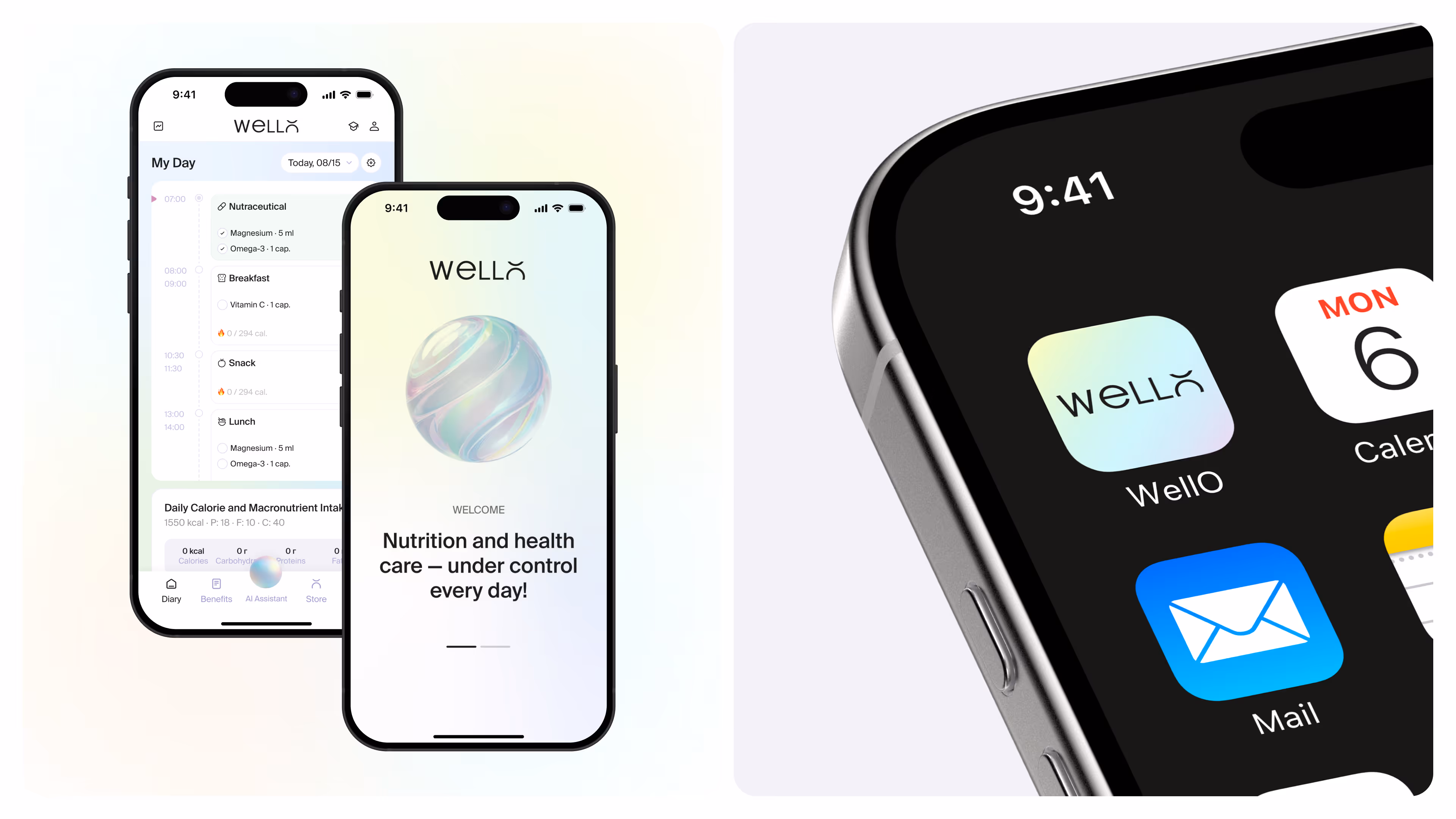
Wello
Services & Technologies
Deliverables
task
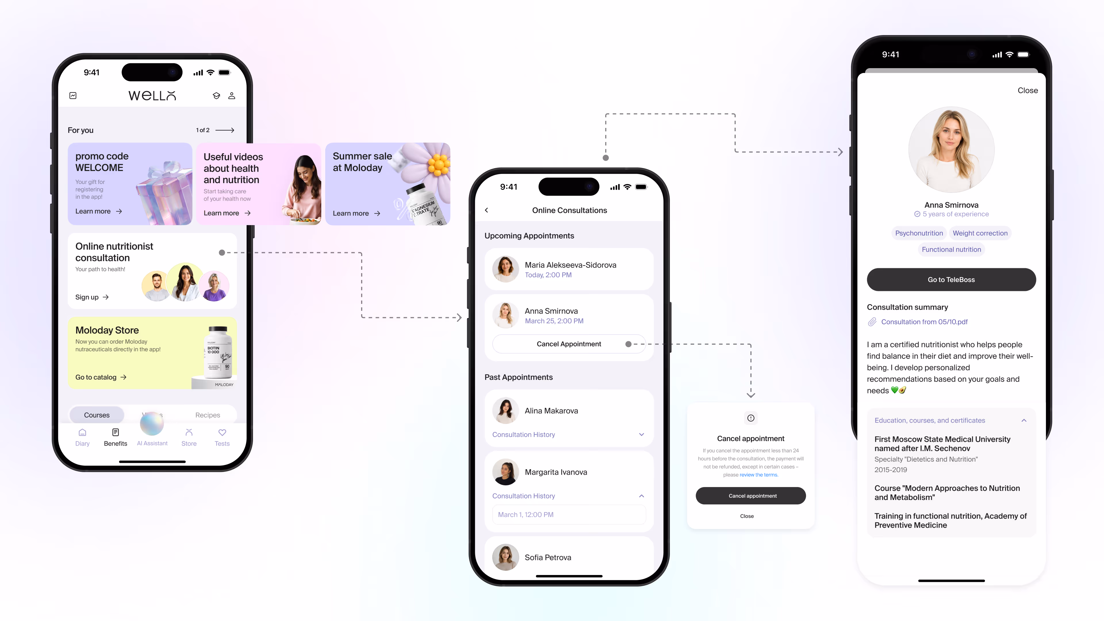
To design a health-tracking ecosystem for an integrative nutraceutics academy — from a blank slate to a scalable app that connects nutritionists with their clients and grows without ever feeling overloaded.
year
About the project
From Blank Brief to Health Ecosystem
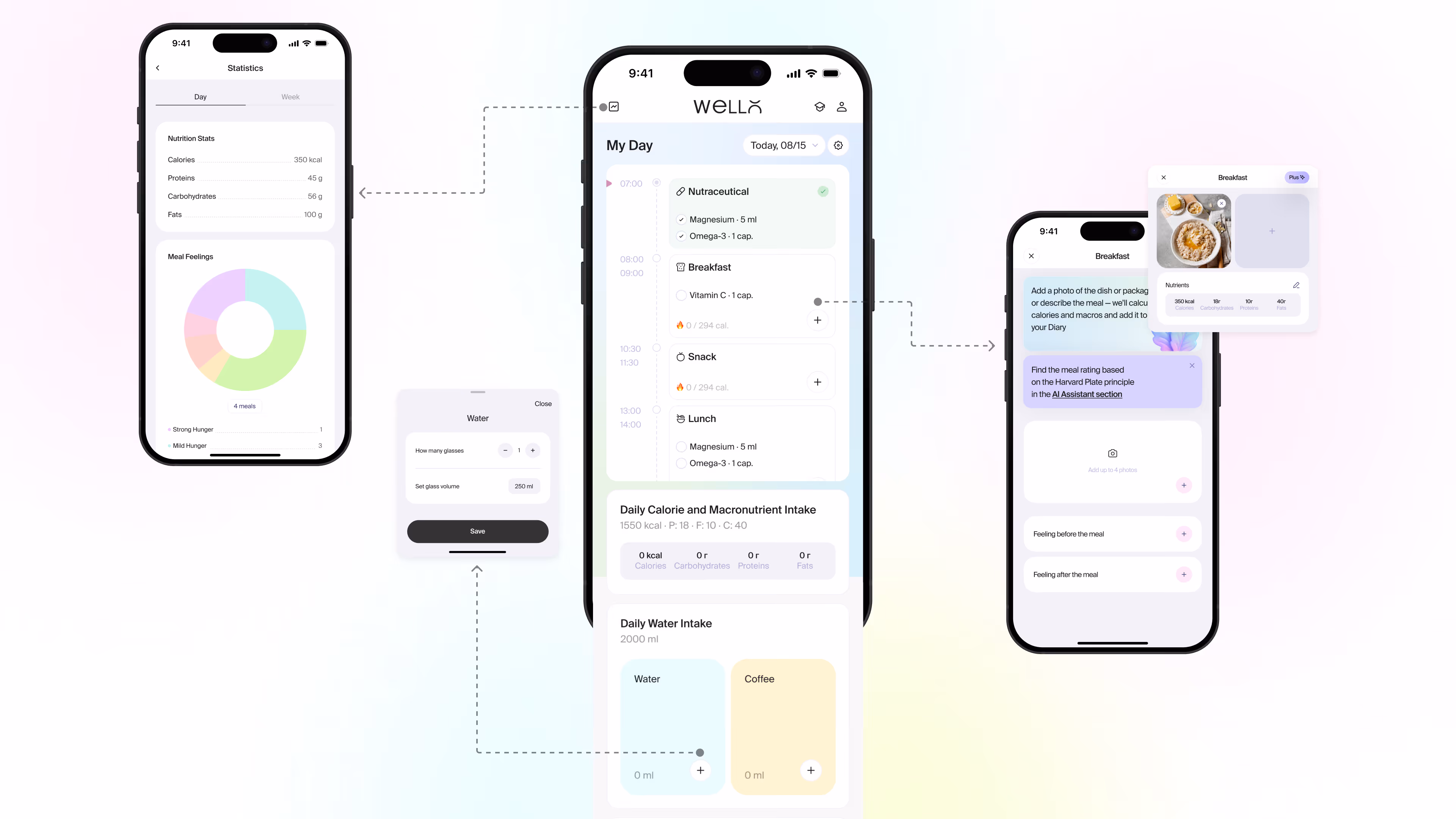
WellO started as a simple nutrition diary with macro tracking. A year later, it's a full health ecosystem — with expert recommendations, video courses, in-app supplement purchasing, and an AI assistant that evaluates meals, helps build balanced diets, and keeps users motivated. Our challenge wasn't just to add features. It was to make each one feel like it belonged. We approached the product iteratively: building structure step by step, testing hypotheses, and moving from simple to complex. The result is a flexible user flow where familiar actions stay effortless, and new capabilities surface organically — without cluttering the interface or overwhelming the user.
Team involved

Alina
Alina

Liuda
Liuda

Julia
Julia
About the client
The Academy of Integrative Nutraceutics came to us with no product concept, no guidelines, and a need to move fast. They operate at the intersection of clinical nutrition and supplement science — helping practitioners give clients a more complete picture of their health. What they had was a clear mission and a brand identity worth protecting. What they needed was someone to translate that into a product people would actually want to use every day.
30+
Design
UX/UI Principles
The core experience is built around two personas: the nutritionist and their client. Each has their own flow, but the product has to feel coherent across both. We mapped the key scenarios early — meal logging, nutrient tracking, supplement reminders, course consumption, and purchasing — and designed a hierarchy that lets users move between them naturally. New features were introduced without restructuring what already worked. The AI assistant was integrated as a contextual layer, present when useful, invisible when not. Every addition was measured against one question: does this make the product feel bigger, or better?
the result
Built to Scale Without Losing Simplicity
A health app that scaled from a food diary to a full-featured wellness platform in twelve months — without losing clarity, without overwhelming users, and without breaking what made it easy to use in the first place.
Check our projects