.svg)
.png)
.svg)
.svg)
.svg)


Most SaaS onboarding fails for a boring reason: nobody designed the first five minutes. The signup flow gets attention, the dashboard gets attention, and the gap between them — the part where a stranger becomes a user — gets a generic welcome modal and three tooltips nobody reads.
A good onboarding flow is a UX problem before it’s a growth problem. This guide gives you a working SaaS onboarding checklist and looks at how 9 well-known SaaS products handle their first-run experience, so you can borrow what works and skip what doesn’t.
Why onboarding UX decides whether a SaaS product survives trial
Every SaaS company measures activation differently, but the underlying question is the same: did the user reach the moment your product actually solves their problem, or did they bounce before getting there? The onboarding flow is the only part of the product whose entire job is answering that question as fast as possible.
Three things make SaaS onboarding harder than onboarding for a consumer app:
Team products need more than one person to get value — a project management tool is useless with an empty board and no teammates invited. Complex products have a real learning curve, so “skip the tutorial” is often the wrong default. And B2B users are impatient: they’re evaluating three competitors in parallel and will not tolerate a ten-step tour before seeing anything useful.
Good onboarding design works around all three by getting the user to a real, personal result — not a demo, their own first project — as early as the flow allows.
The SaaS onboarding checklist
Use this as an audit list for an existing product or a brief for a new one.
- Define one activation moment, not a feature list. Before designing screens, agree on the single action that proves the product delivered value — sent the first message, published the first page, invited the first teammate. Every onboarding decision should be judged against how fast it gets a new user to that moment.
- Ask for context before showing UI. A short intent-capture step (role, team size, use case) lets you route people into a version of the product that’s already relevant, instead of a generic empty state. Keep it to 2-3 questions — every extra field is a drop-off point.
- Replace the empty state with a populated one. A blank dashboard signals “this is unfinished,” not “this is powerful.” Pre-fill a sample project, seed demo data, or auto-generate a first workspace from the context captured in step 2.
- Make the first win reachable in one sitting. If reaching value requires configuration, integrations, or teammates, build a guided path that gets a personal version of that win first — a single-player mode before the multiplayer one.
- Use progressive disclosure, not a feature tour. Introduce advanced functionality only when the user is about to need it (contextual tooltips, empty-state prompts inside a specific view), rather than front-loading every feature in a five-step modal tour.
- Show progress, not just steps. A visible checklist or progress bar (”3 of 5 set up”) gives users a reason to finish — completion bias is one of the most reliable levers in onboarding design.
- Design the invite/team step as its own flow. For collaborative products, inviting teammates is usually the biggest drop-off point in the whole funnel. Make it optional but easy to return to, and show what the product looks like once others join.
- Instrument every step before you launch it. You cannot fix what you can’t see — track step-by-step completion and time-to-first-value from day one, not after the redesign ships.
- Give first-run copy an actual owner. Empty states, tooltips, and confirmation messages are UX writing, not filler text — vague microcopy (”Get started!”) wastes the one moment a user is paying full attention.
- Plan for the return visit, not just day one. Onboarding doesn’t end at signup — a lifecycle email or in-app nudge that brings a user back to finish the checklist matters as much as the first session.
9 real SaaS onboarding flows worth studying
These are some of the best SaaS onboarding examples available today — widely used products with distinct, well-documented approaches to first-run UX. Descriptions below are general observations about publicly visible product behavior, not proprietary data, use them as a starting point for your own walkthroughs before designing.
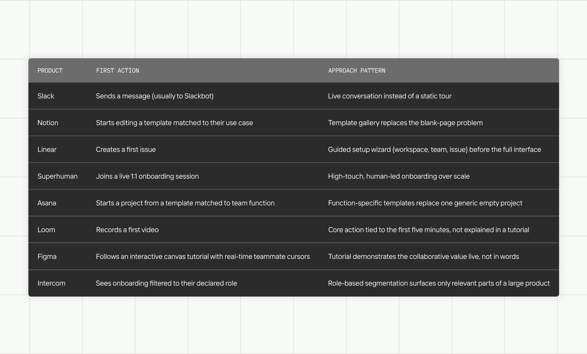
Pattern across all 9: none of them open with a feature tour. Every single one gets the user producing something (a message, a page, a design, a connection) before explaining the rest of the product.
Turning this into your own onboarding audit
If you’re redesigning onboarding for an existing SaaS product, run this as a working session rather than a checklist review:
Map your current flow screen by screen and mark, honestly, where a first-time user would be tempted to close the tab. Compare that map against the checklist above — most gaps cluster around one or two of the ten points, rarely all of them. Then prototype the fix for the single biggest gap first; onboarding redesigns that try to fix everything at once usually ship late and get watered down in review.
This is also exactly the kind of problem a UX/UI audit is built for — an outside read on where real users stall, backed by the same first-principles checklist used here, rather than internal assumptions about what “should” be confusing. If you’re evaluating customer onboarding SaaS platforms to support the redesign, or just benchmarking your own product’s first-run flow against the field, that outside read is usually what surfaces the gap fastest.
FAQ
- What’s a good SaaS onboarding completion rate?
There’s no universal benchmark — it depends heavily on product complexity and whether “completion” means finishing a checklist or reaching real activation. Track your own baseline before and after changes rather than chasing an industry number that may not describe a comparable product. - Should SaaS onboarding be different for free trials vs. paid signups?
Usually yes — free-trial users need to reach value fast enough to justify converting, while a paid signup already has intent and can tolerate a slightly longer, more thorough setup (especially for team/admin configuration). - Is a product tour the same as onboarding?
No. A tour explains the interface; onboarding gets a user to a real result. Products that rely only on a tour tend to see users nod along and still hit a blank state afterward. - How long should SaaS onboarding take?
As long as it takes to reach the defined activation moment and no longer — measure time-to-first-value directly rather than picking a target duration in advance. - What should a SaaS customer onboarding checklist include?
At minimum: a defined activation moment, a short context-capture step, a populated (not empty) first state, visible progress toward setup, and an easy path to inviting teammates — the ten points above expand on each.