.svg)
.png)
.svg)
.svg)
.svg)


Designing filters that work is one of those problems that looks simple until you build one. A good filter UI is invisible: users narrow a thousand results to the five they wanted and never think about the mechanism. A bad one makes them feel like they're fighting the interface. From real estate to e-commerce to analytics dashboards, the right filter UI is what makes it possible for people to find exactly what they're looking for. Below are the filter UI patterns, real examples, and best practices we rely on at INSAIM to build filtering experiences that feel frictionless.
Filtering and sorting are two different things
While it might seem straightforward, it's worth being precise about what filtering actually means and how it differs from sorting. With filters, the interface shows only the items that meet specific criteria, temporarily hiding everything else. Start with 100 items in a data table, apply a filter, and you might end up with 10 results that match. Sorting, by contrast, rearranges the order of those 100 items without removing any of them.
Filtering: narrows the list to only what's relevant.
Sorting: keeps all items but reorders them by an attribute (price, date, relevance).
In most interfaces the two work together. After narrowing results with filters, users still sort what's left — giving them the best of both worlds.
Common Filter Placement Patterns
Designing a robust filter UI starts with deciding where the filters live on the page. Placement significantly affects usability and the whole filtering experience.
Top-of-the-Page Filters
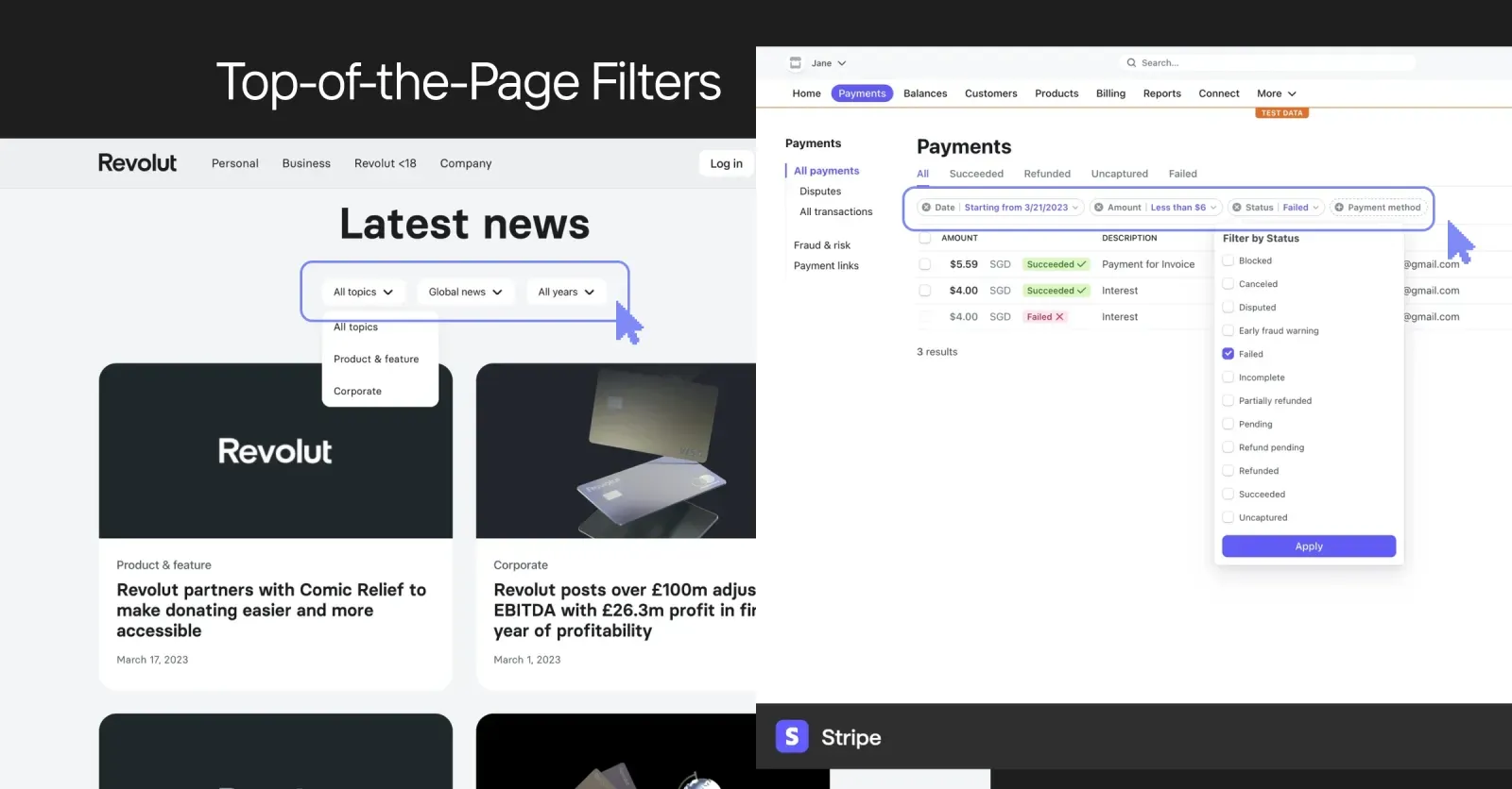
Positioning filters at the top of a page or section works best when there are only a handful of options — a few high-level criteria users toggle often, like category or date range. Top filters are:
- Easily Accessible: Users see them immediately, reducing cognitive load.
- Space-Saving: Minimal use of screen real estate, which is ideal for simpler UI needs.
- Not Very Scalable: If you need to add more filters, the top bar can quickly become cluttered.
Revolut and Stripe use filters at the top of the content. With only a few filters, this placement works perfectly.
Side-Section Filters
If your product deals with many filtering options — a category list, subcategories, price ranges, brand lists — a side-section filter is usually the best bet. This layout:
- Handles Many Criteria: Ideal for websites with extensive product catalogs, such as an online real estate portal or an e-commerce store with numerous brands.
- Expandable/Collapsible: You can show or hide advanced filters, preserving valuable space for main content.
- Unified Impact: All page elements should respond to these filters for consistency.
Pro tip: make sure the rest of the page — the product listing especially — adjusts in real time as the side-section filter changes. That immediate feedback loop is what makes the interaction feel responsive.
Modal Filters for Advanced Options
For complex or rarely used filters, placing them in a modal can be a great approach. The modal can contain advanced or less frequently accessed criteria, keeping the UI uncluttered. This approach is beneficial for:
- Occasional, In-Depth Filtering: Users who need these options will seek them out.
- Preventing Overload: Hides complex filters that aren't always necessary.
- Focused Interaction: Ensures the user is fully engaged with filter choices when the modal is open.
Real-Life Example by INSAIM design
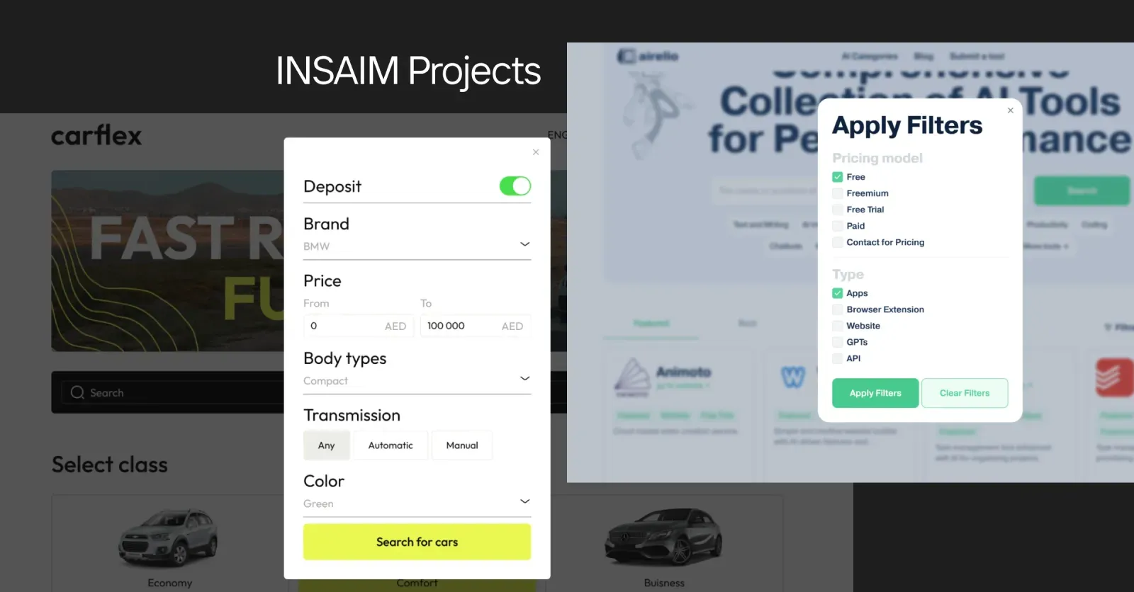
Carflex, a car rental platform, offers advanced vehicle features and insurance coverage filters in a modal. Since most visitors only need basic filters—like car type and location—the advanced ones stay out of sight until needed.
Airelio, a platform that curates the best AI tools, places filters—such as pricing models and tool types—in a modal. This keeps the interface clean by hiding filters that aren't essential to the user.
Filter panel UI: structure and components
A filter panel is more than a list of checkboxes. Whether it sits in a sidebar or a modal, a well-built filter panel UI shares a common anatomy — and how you arrange those parts is what separates a panel users navigate effortlessly from one they have to decode.
- Grouped criteria with clear headers. Cluster related filters (Price, Brand, Availability) under labelled, scannable groups rather than one long undifferentiated list. Grouping is the backbone of a readable panel.
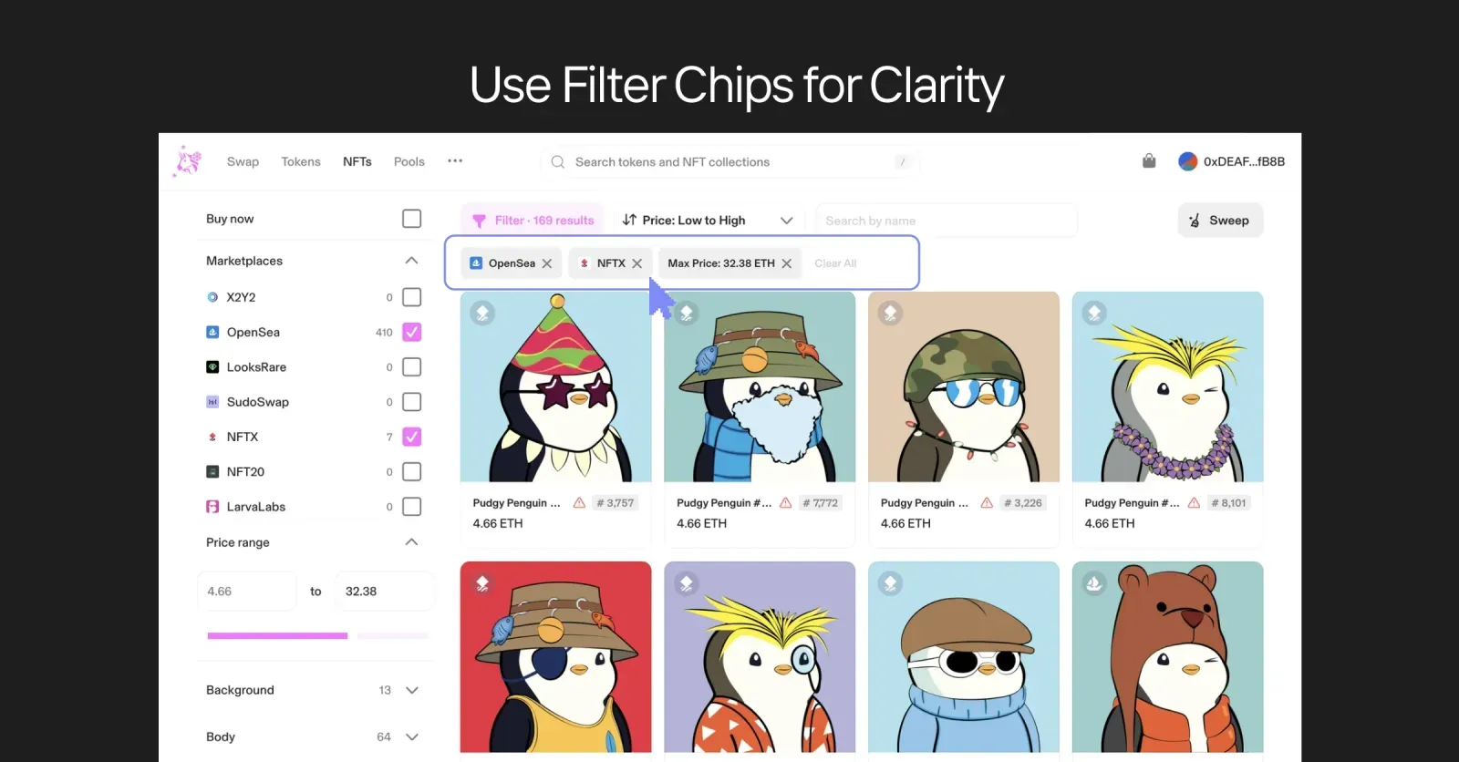
- A dedicated space for active filters. Reserve a spot — the top of the panel or a strip above the results — where current selections live as chips. Where you place them matters: users should see what's applied without hunting for it.
- Controls at the bottom. Position the clear-all and, where used, the Apply button in a consistent, predictable place — conventionally the panel's foot — so users always know where to commit or reset.
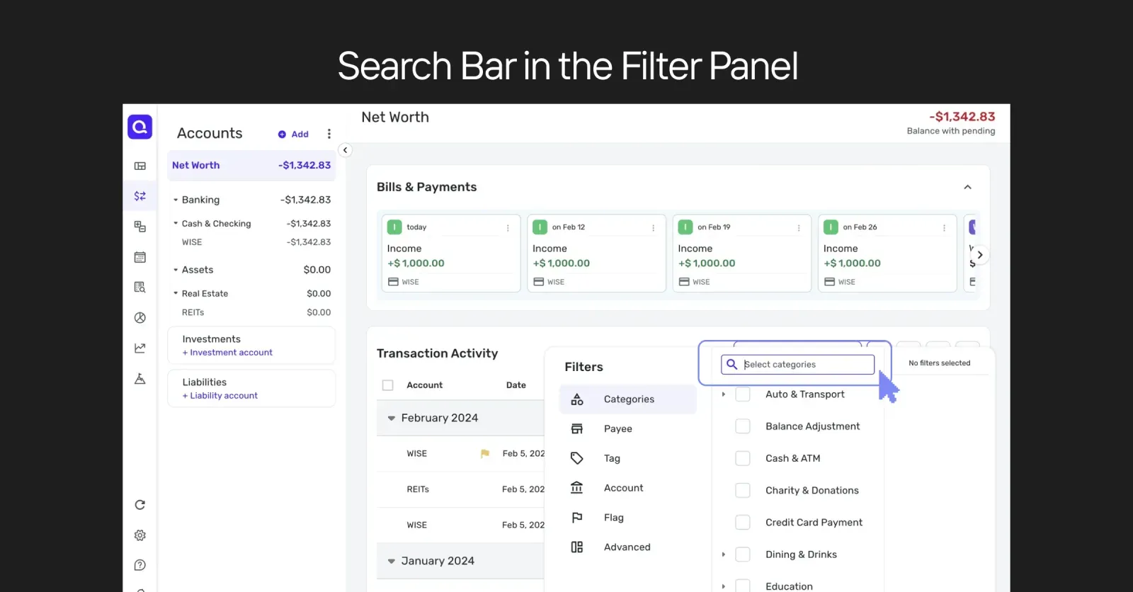
- A search field inside the panel. When the list of options runs long (50 brands, 30 tags), put a search box at the top of the panel so users can jump straight to the option they want instead of scrolling.
- Room to collapse. Build groups so long option lists can collapse to the top five or six with a "Show more" expander, keeping the panel's overall height manageable.
Get these components consistent across the product and the filter panel stops being something users have to learn each time.
Basic Rules for Filter UI Success
A handful of rules hold across almost every filter UI:
Show a Loading Indicator. Whenever a filter is applied, signal that the system is working — a simple animation reassures users something is happening rather than leaving them wondering if the click registered.

Display the Number of Results. Show how each filter changes the count, ideally at the input level ("Red (12)", "Blue (7)"), so users see where results exist before they commit and never hit a surprise "no results" wall.

Make chips removable, not just visible. Displaying active filters as chips is a structural choice; the behavioral rule is that every chip must be a one-tap way to undo that filter. Selection without easy removal frustrates more than it helps.
Use precise language. Label actions clearly — "Reset" and "Apply" beat vague terms like "Close." Precise labels lower confusion and raise confidence in what each control will do.
Make "clear all" instant. One click should remove every active filter and return the user to the full set. Resetting is how people explore; make it frictionless.
Filter UX best practices
Filter UI is what the filtering experience looks like; filter UX is how it feels. The components can all be present and the experience still frustrate people if the behavior underneath is wrong. A few best practices we hold to at INSAIM, drawn from watching how people actually behave when they filter:
- Design for uncertainty, not precision. People rarely arrive knowing the exact criteria that will get them to the right result. They probe, adjust, and backtrack. Good filter UX makes that exploratory loop cheap: every change is reversible, results update visibly, and no single choice ever feels like a commitment. When users trust that they can undo anything, they filter more freely and find things faster.
- Never dead-end the user. The worst filter UX outcome is an empty result set with no way forward. Show result counts before a filter is applied, and when zero results are unavoidable, offer a helpful message and a route out — loosen the last filter, suggest alternatives, or surface the nearest matches.
- Match feedback speed to the action. Instant, real-time filtering feels best when the operation is cheap, because the immediate feedback shows users how each choice shapes the results. Reserve an explicit Apply button for cases where filtering is expensive or where users genuinely want to stack several criteria before running the query.
- Keep the mental model simple. A filter that users can't remember using is a filter that worked. The goal isn't a clever interface; it's an interface that disappears.
Special Considerations for Category Filters
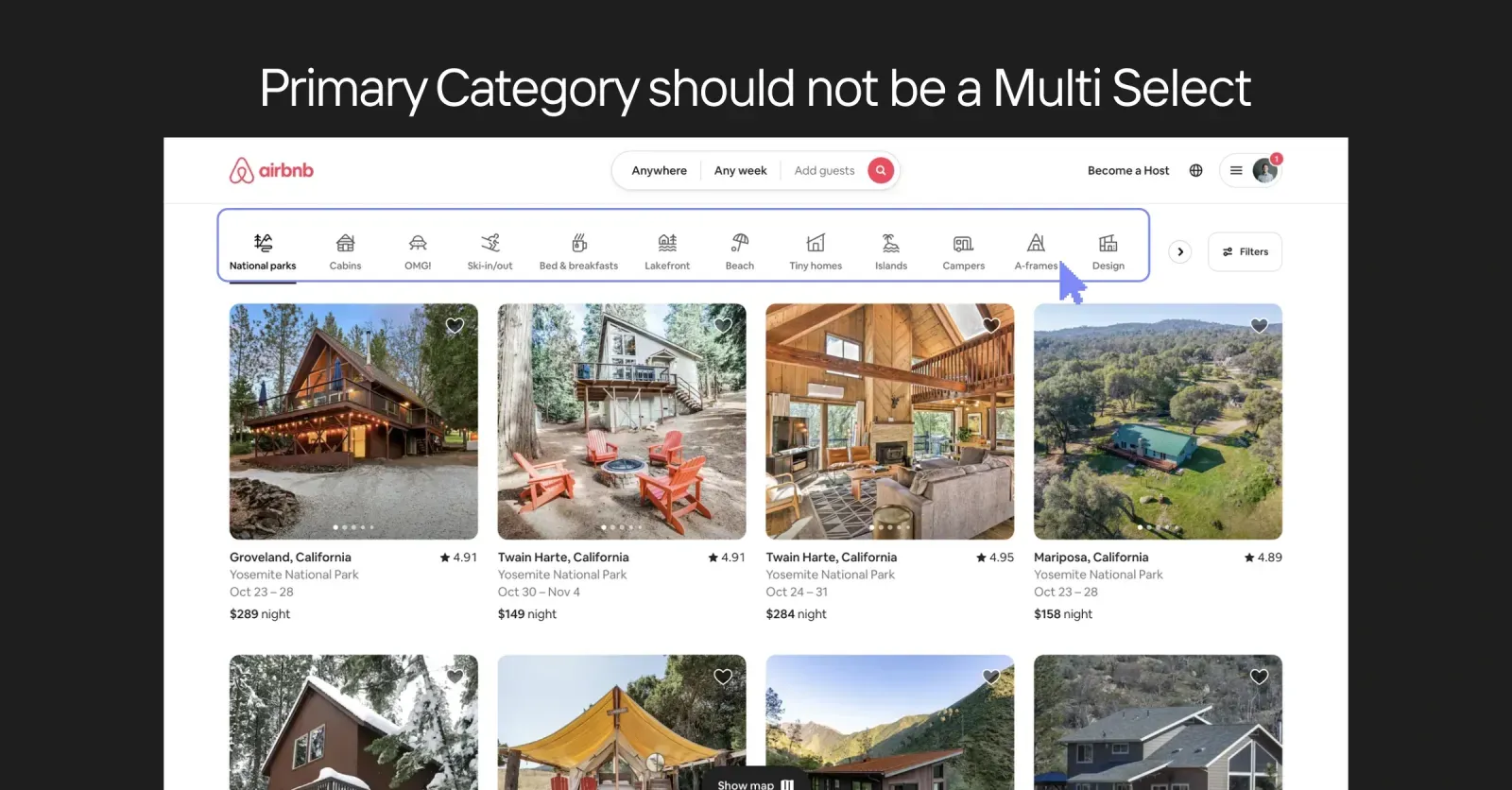
In most cases, a primary category should not be multi-select. "Toys" and "Food" are typically distinct — showing results for both at once rarely makes sense. Encourage users to move between primary categories via the main menu instead, keeping them separate. Subcategories, though, can often be multi-select where combining items is logical.
When to Add a Search Bar in the Filter Panel
If your platform offers a wide range of filters — product attributes, brand names, complex property features — a search bar inside the filter panel can be a lifesaver. It's especially useful when users remember only part of a brand name or can't recall the exact subcategory they want. Rather than scrolling a list of 60 brands, they type three letters and they're there.
Date Range and Quick Select Options
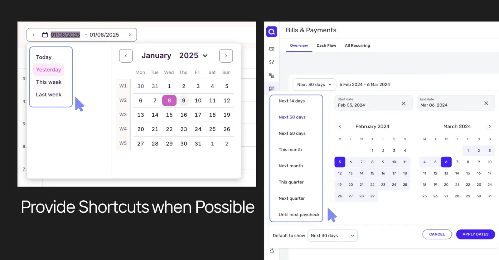
Filtering by date is common in dashboards, analytics tools, and real estate sites. Alongside a standard date picker, offer shortcuts — "Today," "Yesterday," "This Month." A simple set of quick options speeds up the most common selections and reduces the friction of hunting through a calendar.
Collapsing Filter Options
When there are too many options — 50 brand names, 30 product tags — collapse the full list and show only the top five or six. An expandable "Show more" accordion lets power users dig deeper without overwhelming casual browsers.

Instant Filter Changes vs. Apply Button
- Instant (real-time feedback): as soon as users select or deselect a filter, the results update. Great for UX because it shows immediately how each choice affects the outcome.
- Apply button: better when filtering is time- or resource-intensive, or in advanced scenarios where users want to set several criteria before running the search.
AI-powered search and filtering
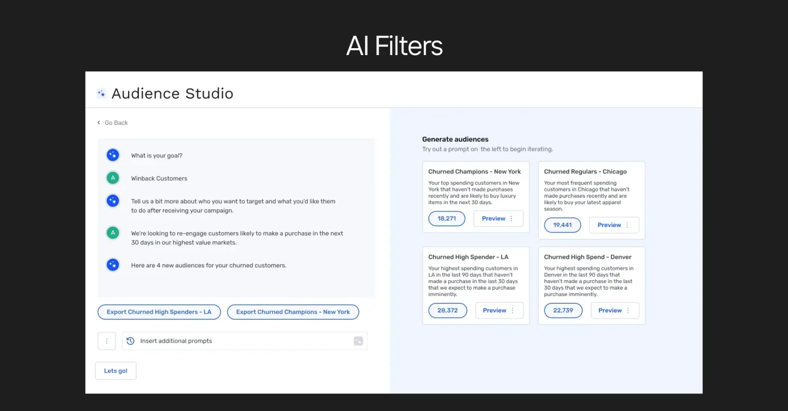
AI filters use machine-learning models to interpret text-based requests or to suggest filters based on user input and behavior, turning a static filter panel into a context-aware experience. A user might type "family-friendly hotel in Spain with a pool," and AI-driven filters resolve it into "Location: Spain," "Amenities: Pool," "Travel Type: Family" — no manual toggling required.
This is where filtering and search UX are converging. Advanced search UX increasingly means letting people describe what they want in natural language and having the system translate intent into structured criteria. GrowthLoop, a marketing technology platform, uses AI filters for advanced segmentation. At INSAIM we build AI elements into many projects for exactly this reason — predicting user intent and surfacing highly relevant results turns filtering from a chore into something closer to a conversation.
Ready to take your ux design to the next level?
Filters are the silent curators of design that shape not just how the user experience looks, but how it feels. Make sure your filters are intuitive, seamless, and easy-to-use. And the golden rule: if the user doesn’t remember how they used the filter, it means the experience was truly seamless. Good luck with filters!
At INSAIM Design Studio we specialize in design that simplifies user journeys and pulls actionable insight out of complex data. Fill in our brief or schedule a call with our team to learn how we can elevate your product’s filtering experience. Let’s work together to build a filter UI that truly works—for you and your users.
FAQ
- How do I decide which filter style — top, side, or modal — fits my project?
It depends on the volume and complexity of your options. For a few crucial filters, use the top of the page. For larger sets, a side section avoids cluttering the main content. For many advanced filters users only occasionally need, a modal keeps them out of sight until necessary. - Should I let users select multiple primary categories?
Usually not — primary categories tend to represent distinctly different groups. Subcategories and secondary attributes, however, can be multi-selectable where combining them makes sense. - What's the best way to handle "no results" scenarios?
Proactively show the number of items next to each filter so users see where results exist. If no results still occur, offer a helpful message and alternative suggestions to guide them somewhere productive rather than a dead end. - What's the difference between filtering and sorting in UI design?
Filtering narrows results to items matching the selected criteria, hiding the rest. Sorting reorders all items by an attribute like price or date without removing any. Strong interfaces use both together. - Why use filter “chips” or tags for selected filters?
Active-filter chips give users at-a-glance clarity on which criteria are applied and a fast way to remove or adjust them — especially valuable when several filters are active at once.


