.svg)
.png)
.svg)


Most SaaS product landing pages are built by feel. A hero section here, some feature callouts there, testimonials somewhere near the bottom, a CTA at the end. The structure looks familiar — because it mirrors every other page in the category. And that's precisely the problem.
According to Unbounce's Conversion Benchmark Report — one of the most comprehensive analyses of landing page performance across industries — the median conversion rate for SaaS is 3.3%. The gap between a page that sits at that median and one that meaningfully outperforms it is rarely explained by visual design. It comes down to structure — specifically, whether the page is built around the right framework for the right audience.
At INSAIM, we spent time breaking this down systematically. Not by collecting screenshots, but by going deeper: analyzing the frameworks behind high-converting pages, the scroll patterns that deliver them, and the block-level logic that makes each section earn its place. This article is the result of that research — a working system we now use across every product page project.
Start With Awareness, Not Layout
Before choosing a framework, there's a more fundamental question: where does your visitor start?
Eugene Schwartz's awareness ladder, originally developed for copywriting, maps five levels of user awareness — from completely unaware of the problem, to aware of the problem but not the solution, to aware of solutions but not yours, to aware of your product, to ready to act. The level your visitor enters at determines everything: what your headline should say, which block should come first, how much explanation is needed before you can ask for a conversion.
This is the most common mistake in startup landing page design. A founder who has lived with their product for two years assumes the visitor understands the problem. The visitor lands with no context, reads a headline about outcomes they don't yet care about, and bounces. The page wasn't badly designed — it was calibrated for the wrong awareness level.
Pick your framework based on where your visitor starts, not where you want them to end up.

The Four Frameworks — What They Sell and When They Work
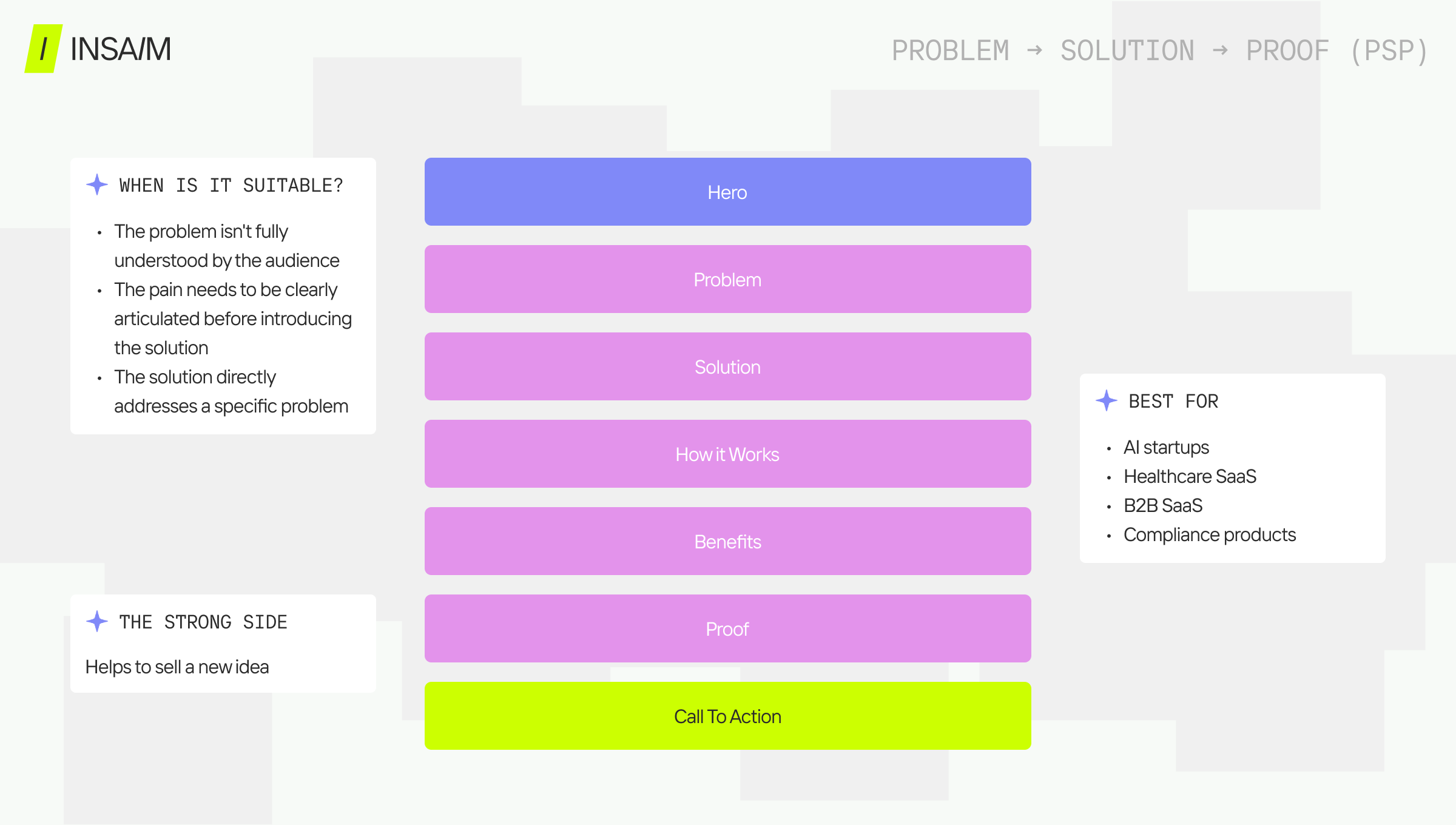
Problem → Solution → Proof
The most universal framework for early-stage products and new categories. It earns the right to present a solution by first making the visitor feel the weight of the problem. The hero establishes context, the problem block creates recognition, a cost-of-inaction section raises the stakes, then the solution appears — with features as supporting evidence, not the lead.
PSP works because people don't buy solutions — they buy relief from problems they've stopped tolerating. The framework builds that intolerance before presenting the exit.
When to use it: low market awareness, B2B HealthTech, compliance products, AI tools solving problems users haven't named yet. Limitation: requires more scroll to reach the product — for visitors who already understand the problem, it feels slow.
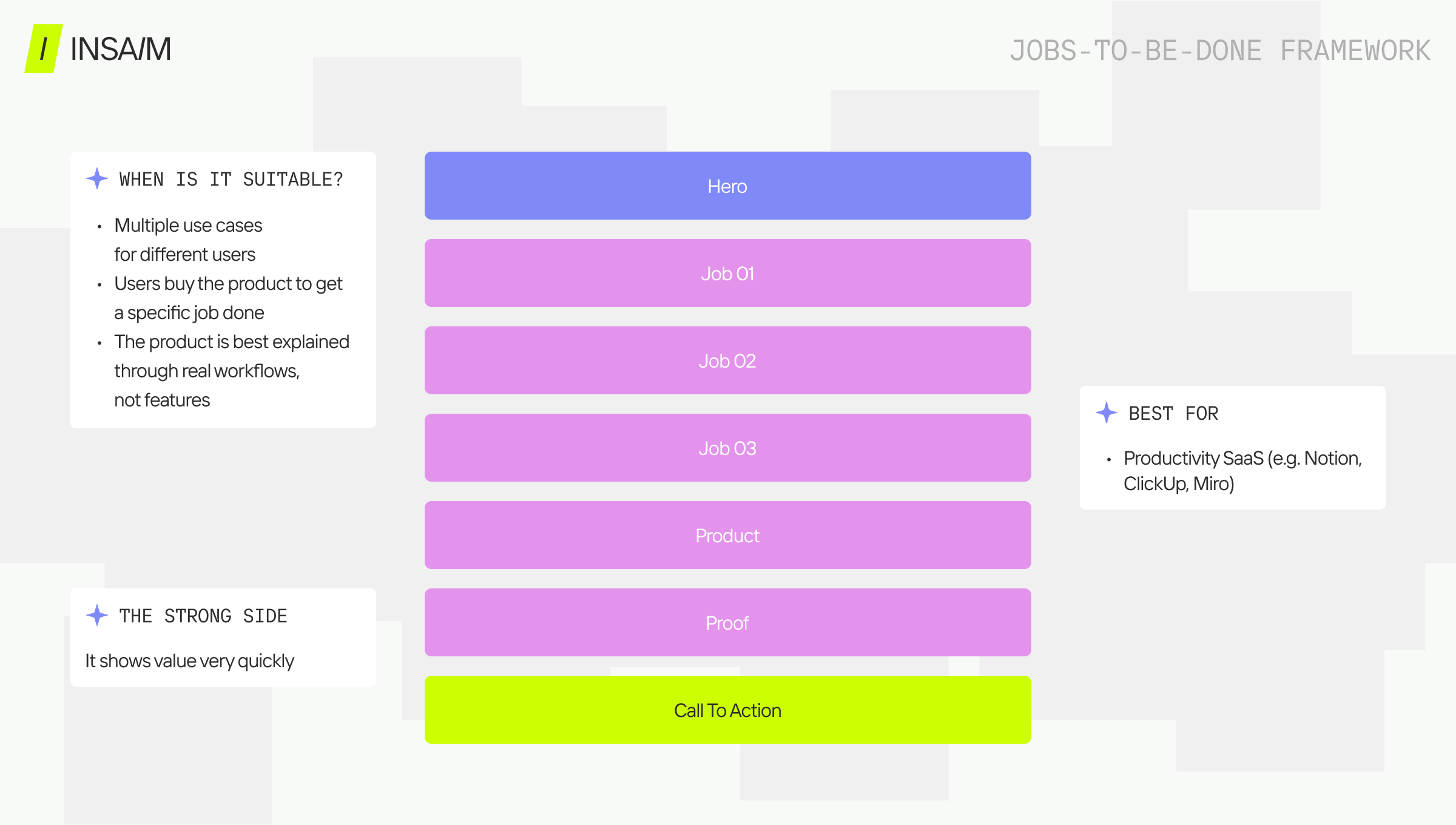
Jobs-To-Be-Done
Where PSP sells relief, JTBD sells fit. People don't buy products — they hire them to do a job. The page organizes around use cases: Job #1, Job #2, Job #3 — each with its own scenario, outcome, and proof. The visitor self-identifies before the page tries to convert them.
Notion is the clearest example. The page doesn't sell a note-taking tool or a database — it sells the job of keeping work organized through the lens of different users. The visitor finds themselves in one of those scenarios and converts based on recognition, not persuasion.
When to use it: multiple distinct user personas, horizontal use cases, multi-stakeholder B2B buying. Limitation: requires strong use case definition upfront. If the jobs aren't specific, the page reads as a feature list with extra steps.
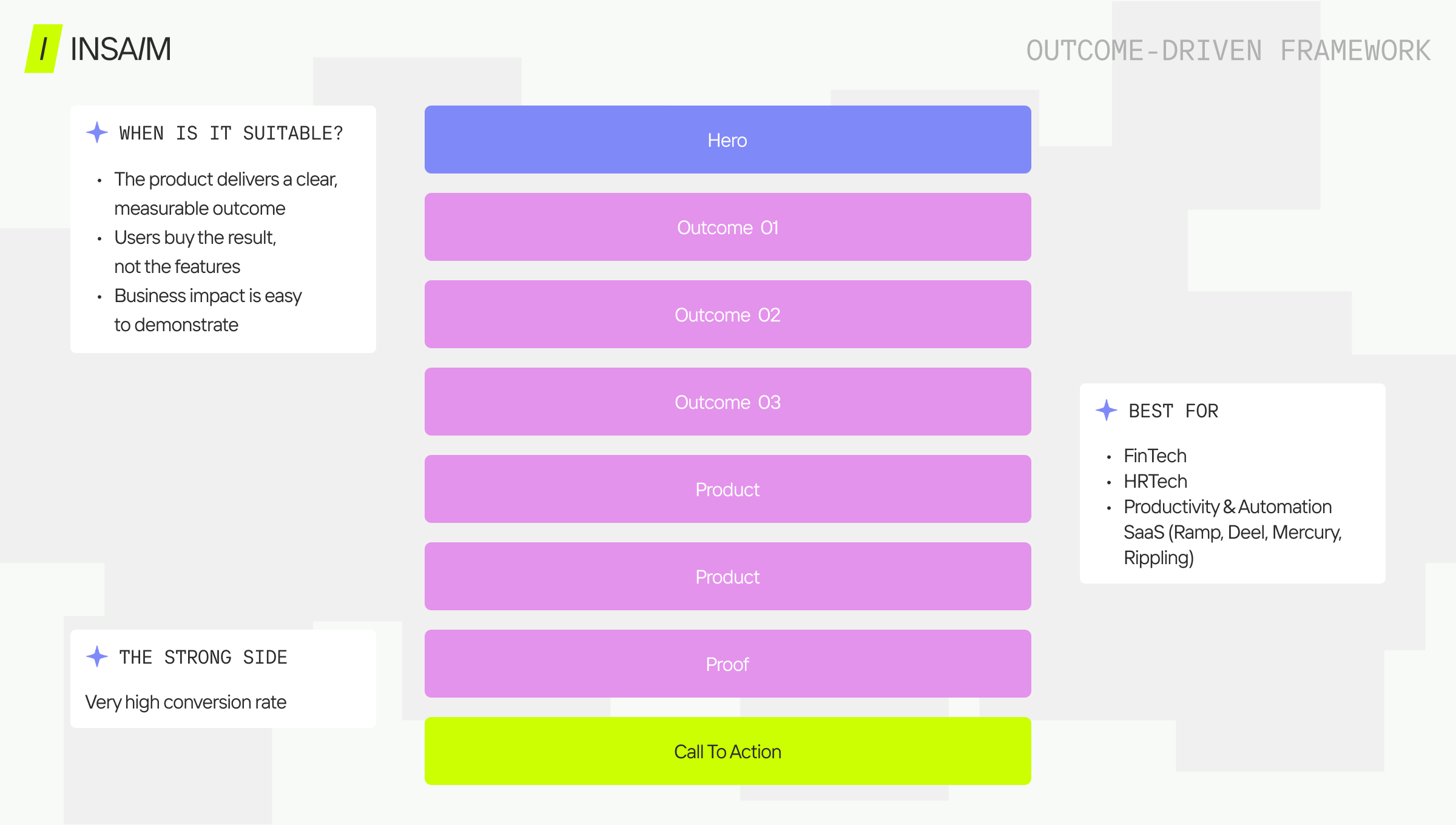
Outcome-Driven
The dominant framework for mature SaaS with established market awareness. It doesn't sell process — it sells the end state. The hero leads with the primary outcome, supporting sections show the mechanisms that deliver it, features appear late as explanation rather than pitch.
Ramp doesn't open with expense management software — it opens with what finance teams accomplish. Clay doesn't lead with enrichment tools — it leads with pipeline outcomes. The product becomes the means to an end the visitor already wants. By 2025–2026 this has become the default pattern for growth-stage SaaS and AI tools, precisely because it compresses the decision cycle.
When to use it: established SaaS with clear ROI, fintech, growth tools, AI products with measurable outputs. Limitation: requires genuine specificity. "Save time and money" is not an outcome — the framework collapses without a real one.
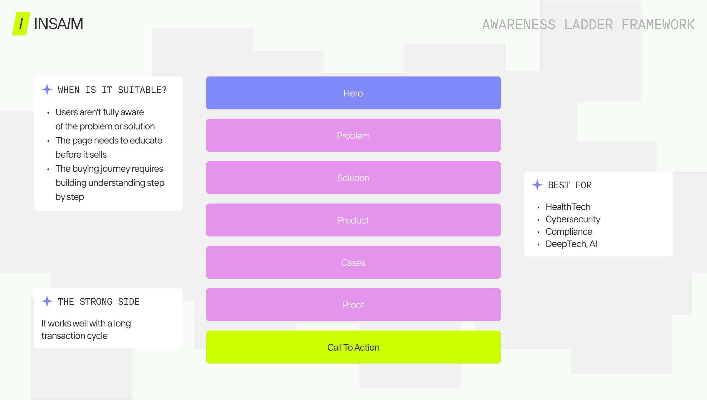
Awareness Ladder
Built for complexity. The right choice when the buying cycle is long, the decision involves multiple stakeholders, and the visitor needs a full belief shift before they're ready to act. Each section moves the visitor one level up the awareness ladder.
Problem awareness comes first — precise enough to land as recognition, not information. Then existing solutions are addressed and found insufficient. Then a new approach is introduced as a category shift, not a product pitch. Only after that foundation is laid does the product appear.
Cybersecurity, enterprise infrastructure, compliance, and complex HealthTech products live here by necessity. The visitor arrives skeptical and accountable to others. A demo-first page won't move them — they need a case built incrementally.
When to use it: enterprise SaaS, long sales cycles, regulated industries. Limitation: the longest path to conversion — not suitable for products where visitors should self-serve immediately.
The Five Scroll Patterns — How the Story Is Delivered
Framework and scroll pattern are distinct decisions. The framework determines what you're selling and in what order. The pattern determines how that story is delivered as the visitor scrolls. One framework can be executed through multiple patterns — choosing the right combination is where the nuance lives.
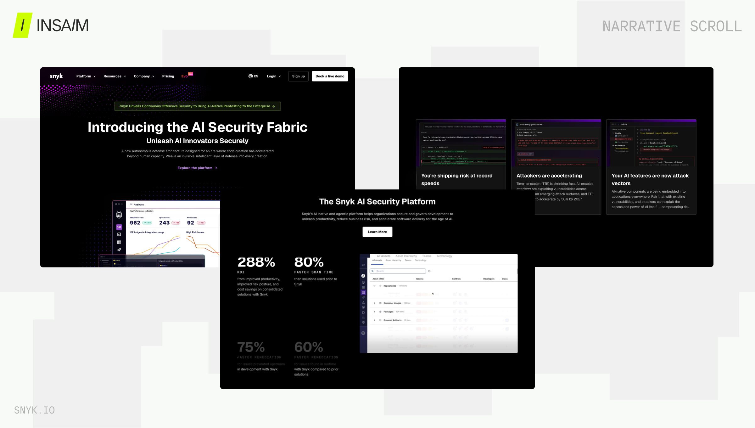
Narrative Scroll
The default pattern for most SaaS products, and for good reason. Every screen answers exactly one question. The visitor is never asked to hold multiple ideas simultaneously — they're walked through a sequence where each section resolves and sets up the next.
Linear, Vanta, and Mercury all use this pattern. The experience feels inevitable — like the page is thinking alongside the visitor rather than pitching at them. It works especially well for complex products that require explanation, because it controls the pace of information without feeling slow.
The critical discipline: each section must earn the scroll. If a section doesn't resolve something or raise a new question, it breaks the chain.
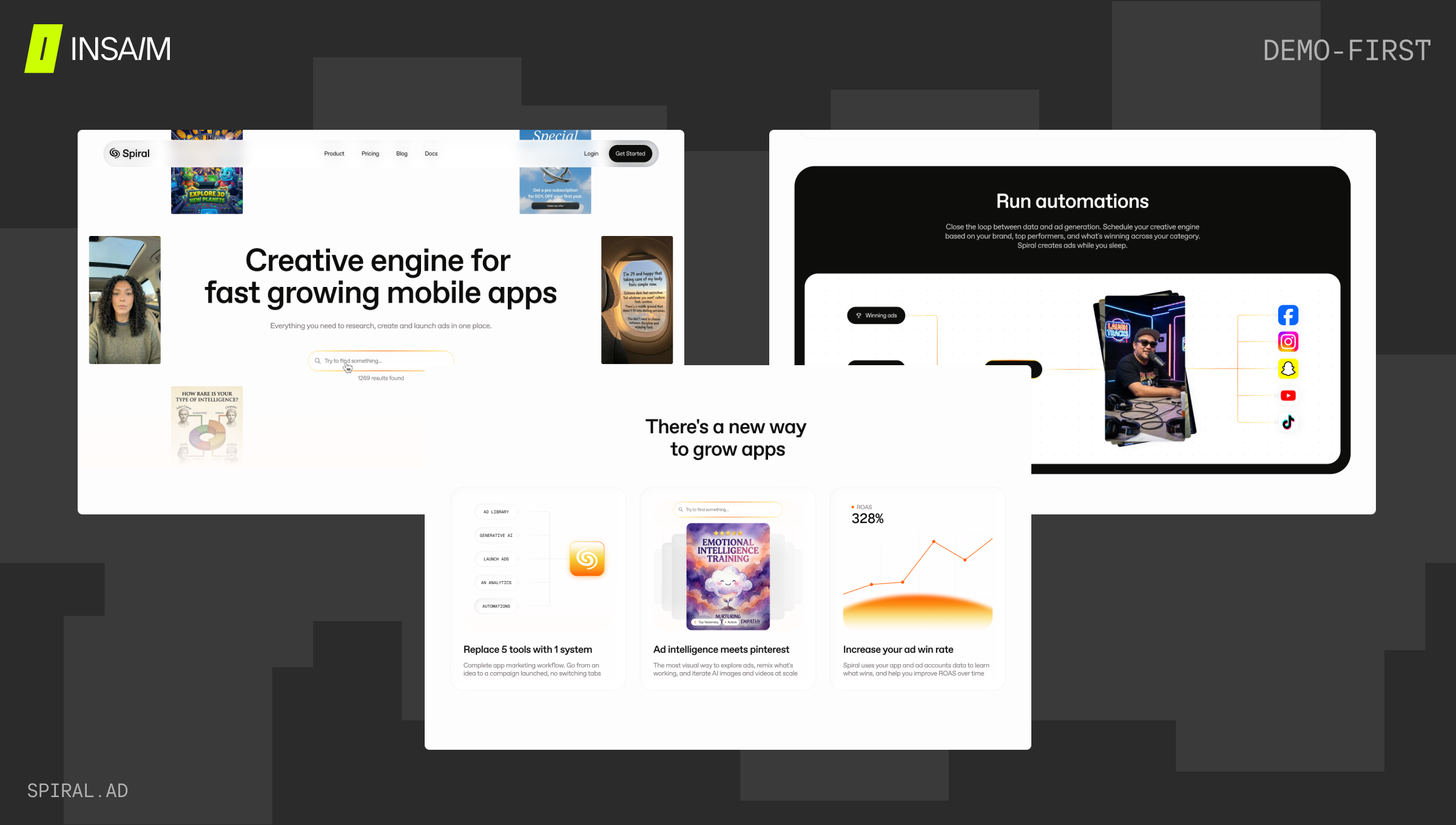
Demo-First
Lead with the product. Everything else follows.
This pattern rose sharply among AI tools and developer products in 2024–2025. Cursor, Bolt, and Lovable all open with the product in action — before any explanation, before any problem framing, before any social proof. The product is the pitch. If the visitor sees the interface and immediately understands what it does and why that's compelling, the rest of the page is just supporting detail.
Demo-first is a high-conviction bet. It works when the UI is genuinely impressive and the value is immediately legible. It fails when the product requires context to appreciate — which describes most B2B SaaS. Applying a demo-first pattern to a product with a complex workflow or an abstract value proposition is one of the most common structural mistakes in startup landing page design.
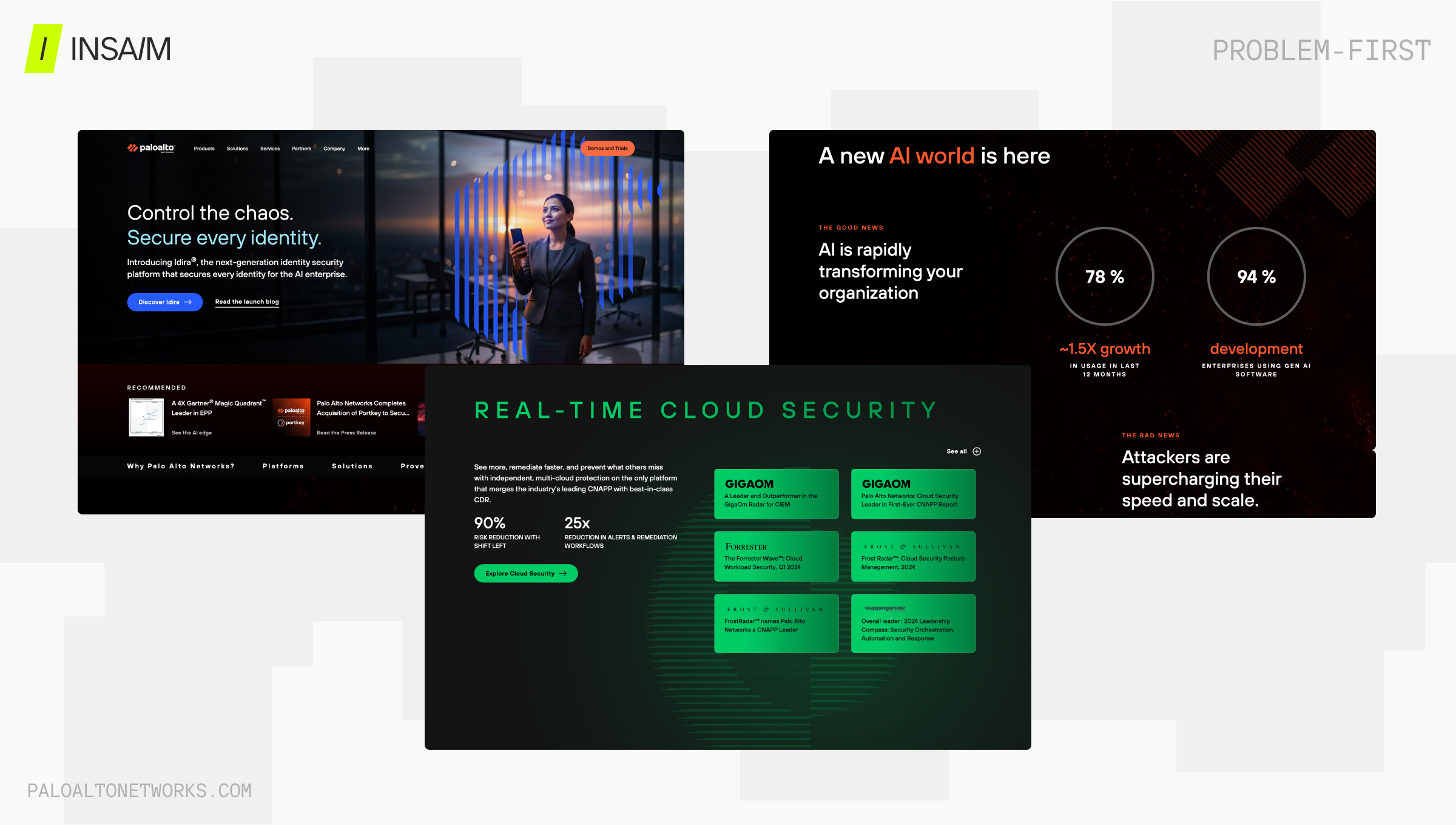
Problem-First
The most durable B2B pattern. The page opens on the pain, lets it breathe, then introduces the product as the resolution.
Problem-first is the natural execution pattern for PSP and Awareness Ladder frameworks. It gives the problem enough space to create genuine tension before the solution appears. HealthTech, compliance, and enterprise products use this because their buyers arrive with the problem already present — they don't need to be told they have it, they need to see that someone understands it well enough to solve it.
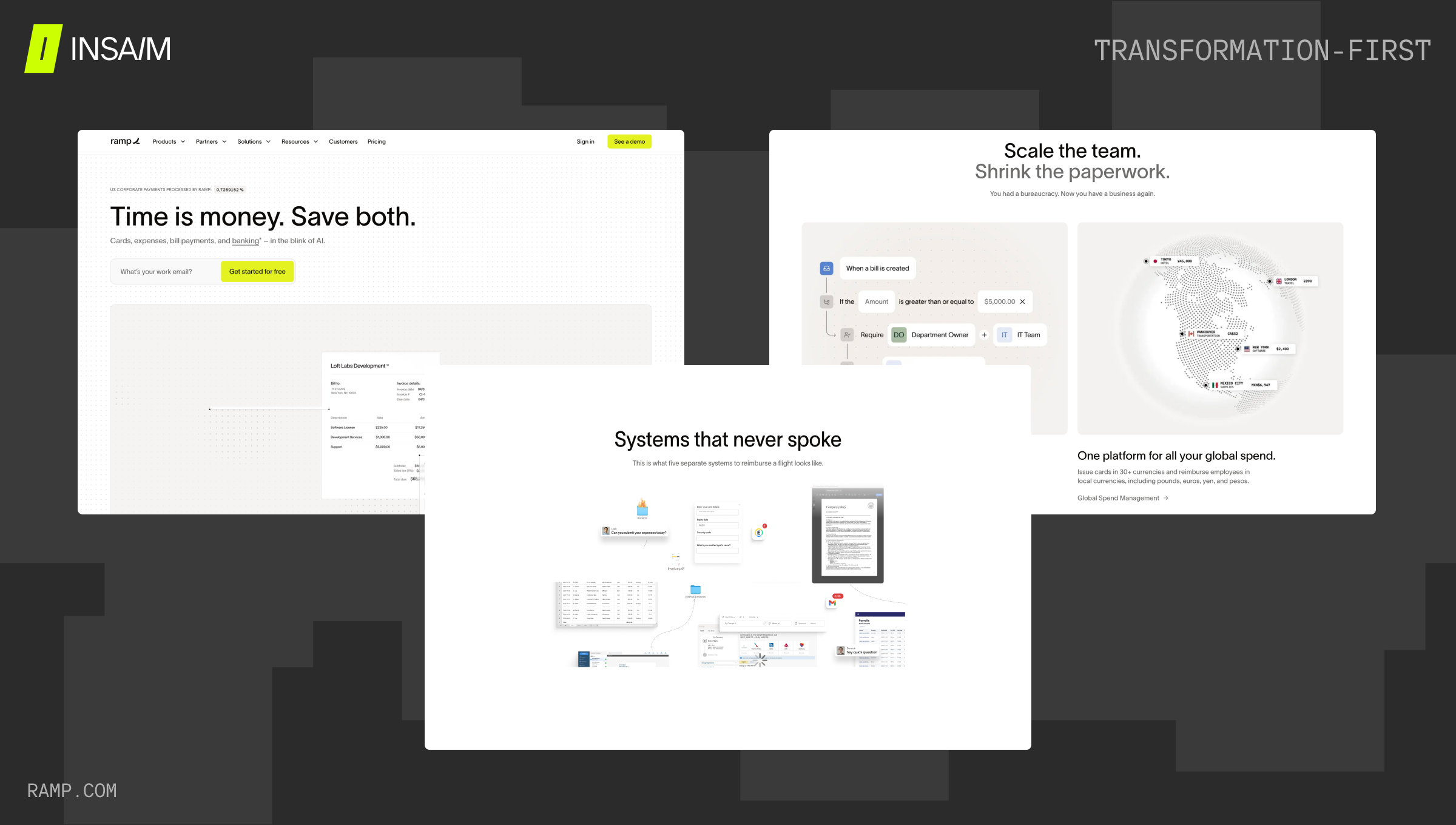
Transformation-First
The fastest-growing pattern in 2025. Where problem-first opens on what's broken, transformation-first opens on what's possible — and makes the contrast between current and future state the emotional engine of the page.
Ramp and Clay both use this architecture. The opening isn't "here's your problem" — it's "here's what your team looks like after." The before/after framing is often explicit: current state described with precision, future state described with equal precision, product positioned as the bridge.
This pattern pairs naturally with the Outcome-Driven framework and works best when the transformation is genuinely dramatic and the product can credibly claim to deliver it. The risk is overclaiming — if the before/after gap is exaggerated, the page loses credibility precisely where it most needs it.
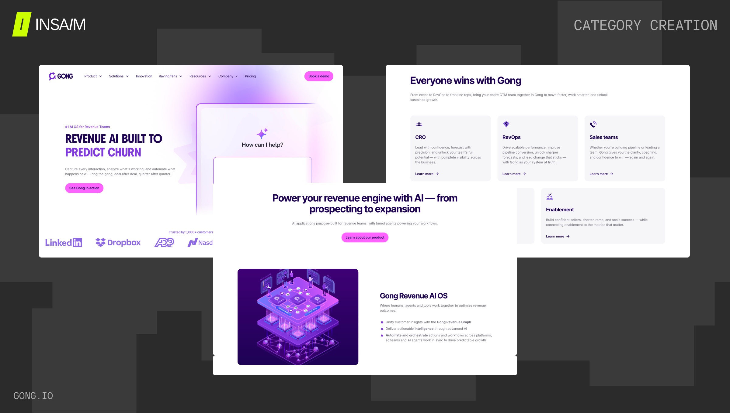
Category Creation
The most ambitious pattern, and the rarest. Used when a product isn't entering an existing market — it's defining a new one. The page doesn't position against alternatives; it argues that alternatives are a different kind of thing entirely.
Early Figma, early Notion, and Gong in its formative phase all used versions of this pattern. The structure is close to Awareness Ladder, but more expansive: it spends significant time establishing why the existing category is the wrong frame before introducing the new one.
Category creation pages are high-risk, high-ceiling. When they work, they define how an entire space is discussed. When they fail, they read as overreach — a company that doesn't understand where it fits.
Block-Level Logic — What Each Section Actually Does
Frameworks and patterns give the architecture. Block logic gives the function. Every section on a product page exists to produce a specific mental state in the visitor — to move them from where they are to where they need to be in order to act. Understanding what each block does at that level is what separates pages that feel designed from pages that feel assembled.
- Hero. The hero's job is not to explain the product. It's to tell the visitor they're in the right place and give them a reason to scroll. It filters audience, signals category, and creates forward momentum. A hero that tries to explain everything stops the visit before it starts.
- Problem. Creates tension. The most effective problem blocks don't list features of the problem — they show consequences. What is actually happening to the visitor because this problem exists? Showing symptoms creates recognition; showing consequences creates urgency.
- Cost of Inaction. Amplifies the tension created by the problem block. This is where numbers and comparisons earn their keep — not as proof of the product, but as proof of the cost of the status quo. Often underused or skipped entirely, which is why pages that include it tend to convert better.
- New Approach. The pivot point. This section doesn't introduce the product — it introduces a new way of thinking about the problem. It reframes the category before naming the solution. Pages that skip this and jump from problem to product ask the visitor to make a logical leap without the conceptual bridge.
- Solution Overview. One main thesis. Not a feature list — a positioning statement that says what the product is and why it exists. The most common failure here is trying to communicate too much. One clear claim is worth more than five qualified ones.
- How It Works. Reduces uncertainty. Three to five steps, as simple as possible. The visitor doesn't need to understand the full architecture — they need to believe the product is comprehensible and that the path from sign-up to value is short.
- Outcomes / Benefits. Translates features into states the visitor wants to occupy. Formatted as before/after wherever possible. This section should answer: what does my work life look like when this is working? Not what does the product do, but what does the visitor get to stop doing, start doing, or do better.
- Social Proof. Confirms that others have arrived where the visitor wants to go. Results matter more than compliments. "We saved 12 hours a week" converts better than "Amazing product." Placement matters: logo bars work above the fold, case studies work after outcomes, testimonials work near the CTA.
- FAQ. Closes the remaining objections. The most common mistake is using FAQ to repeat information already on the page. Real FAQ blocks answer the questions visitors actually have — about implementation, pricing structure, support, integration with existing tools. These are the questions that would otherwise go to a sales call.
- CTA. Resolves the story. One primary action per page. The CTA should feel like the natural conclusion of the argument the page has been building — not a sudden ask. The language matters: "Start free trial" performs differently than "See how it works" performs differently than "Book a demo." The right choice depends on where the visitor is in their decision process and what the lowest-friction next step actually is.
How to Choose — Framework × Pattern Decision Map
Four questions drive the selection:
- How aware is your visitor of the problem?
Unaware or early-aware → PSP or Awareness Ladder.
Already aware → Outcome-Driven or JTBD. - How many distinct use cases does your product serve?
One core use case → PSP, Outcome-Driven, or Awareness Ladder.
Multiple distinct jobs → JTBD. - Does your UI sell itself on first sight?
Yes → Demo-first pattern.
No → Narrative Scroll or Problem-first. - How long is your sales cycle?
Self-serve, short cycle → Outcome-Driven or Demo-first.
Multi-stakeholder, long cycle → Awareness Ladder with Problem-first or Narrative Scroll pattern.
The most common combination for early-stage startups building a SaaS product landing page: PSP framework + Problem-first or Narrative Scroll pattern. The most common combination for growth-stage SaaS in 2025: Outcome-Driven framework + Transformation-first pattern.
The Most Common Structural Mistakes
Choosing a pattern based on a reference, not on audience logic. Cursor's demo-first page works because the product is visually spectacular and immediately legible. Copying that pattern for a B2B workflow tool with an abstract value proposition produces a page that opens on an interface no one understands yet.
Mixing frameworks without a system. PSP and Outcome-Driven can coexist on the same page — but only if the sequencing is intentional. Most pages that mix them do so accidentally, producing a structure where the visitor is asked to feel the problem and envision the outcome simultaneously, which creates cognitive friction rather than momentum.
Features before outcomes. The single most common mistake across every category. Features are evidence that outcomes are achievable — they belong after the outcome has been established, not before. Leading with features requires the visitor to do the work of connecting them to value. Most visitors won't.
Blocks without function. A testimonial block placed directly after the hero, before the problem has been established, produces a reaction of "testimonials for what?" Social proof is evidence — evidence requires a claim to support. Every block needs a reason to be where it is in the sequence, not just a reason to exist.
Demo-first for the wrong product. Already noted above, but worth repeating because it's so common in 2025. The rise of AI products that genuinely show well in-interface has made demo-first feel like a default. It isn't. It's a high-specificity pattern for products where the UI is the clearest possible expression of value. Most products don't meet that bar.
Conclusion
A product page that converts isn't the output of better copywriting or a more refined visual system. It's the output of a structural decision made before any copy is written or any design is started: which framework matches this audience's awareness level, and which pattern delivers that framework most effectively?
The blocks are the vocabulary. The framework is the argument. The pattern is the pacing. All three need to be chosen deliberately — and they need to be chosen in that order.
FAQ
- What is the best framework for a SaaS landing page?
There is no single best framework — the right choice depends on where your visitor starts. Low-awareness audiences need PSP or Awareness Ladder. Visitors who already understand the problem respond better to Outcome-Driven or JTBD. The framework should match the audience's awareness level, not the founder's preference. - What is the difference between a landing page framework and a scroll pattern?
A framework determines what you are selling and in what order — problem first, outcome first, use case first. A scroll pattern determines how that story is delivered as the visitor moves down the page. One framework can be executed through multiple patterns, and choosing the right combination is where most of the structural nuance lives. - When should a SaaS landing page lead with a product demo?
Demo-first works when the UI is immediately impressive and the value is legible without any prior explanation. It is a high-conviction pattern that succeeds for products like AI tools where the interface speaks for itself. For B2B products with complex workflows or abstract value propositions, leading with a demo typically fails because the visitor has no context to interpret what they are seeing. - Why do most SaaS landing pages underperform?
The most common structural mistakes are leading with features before outcomes, placing social proof before the problem has been established, and choosing a scroll pattern based on a competitor reference rather than audience logic. Each of these creates friction at the exact moment the page needs to build momentum. - What should a SaaS landing page FAQ section actually contain?
FAQ blocks should answer the questions visitors would otherwise bring to a sales call — implementation details, pricing structure, integration with existing tools, and support. The most common mistake is using FAQ to repeat information already covered on the page, which adds length without resolving the objections that are actually preventing conversion.