.svg)
.png)
.svg)


A few months ago, Productlab approached us with the goal of a full brand identity redesign — creating a distinctive visual language that would clearly communicate the company's drive, values, and purpose. The project instantly resonated with us — it was inspiring, and we saw a huge potential in the collaboration.
Daniele and Ahmed had a good grasp on the problem and a clear vision for redesign – the current visual lacked depth, versatility and integrity. We shared these concerns. We both knew that local layout changes wouldn't solve the problem – what we needed was to translate their vision and values into meaningful visual language that would be indicative of the driving force behind Productlab.
We knew we needed a brand redesign
We built it in a bootstrapped and scrappy Berlin startup way. A WordPress with a cool template—it worked for the first conference and by industry standards was kind of okay. But for us, it has so many limitations on usability, capability to expand brand-wise and platform-wise, and it's not yet as inspiring as we wanted it to be.
Positioning: Productlab is...
Behind every creative process is a deep understanding of both the client's vision and the task at hand. What do we want to communicate through design? Who are we talking to? And what is our ultimate goal?
That's why we began with a briefing session to identify key goals, align expectations, and set a clear direction for the brand design. Below are just a few of the questions from our briefing that helped us better understand Productlab.
Company and product
"Productlab is a community and conference for product managers and product builders. We offer an offline conference, hands-on workshops, leadership programs, and executive coaching to foster professional growth and connection.
We focus intensely on community experience, belonging, and taste. We are a curated community where product people find their tribe, learn through practical workshops, and gain leadership skills in an inspiring, high-quality environment"
- Distinctive positioning and value
"Productlab embodies Berlin — a city where you can get wonderfully lost (in ideas, in streets, in product challenges), but never feel like a stranger. Where communities are the fabric, internationals are locals, and everyone's here to change the world through tech, performance, and music energy. We're bringing that spirit beyond Berlin's borders"
- How we want customers to feel when interacting with your brand?
"Inspired, belonging to an exclusive yet welcoming community, confident in the quality and value, excited to participate, and perceiving the brand as professional yet approachable and modern"
- Describing our mission & values that should be reflected in the design.
"To empower product people to build better products, economical outcomes, and careers through genuine connection, hands-on learning, and elevated community experiences"
- Desired logo style
"We want a refined wordmark logo for "Productlab”. We currently have an icon/arrow symbol. We are open to evolving it but not necessarily adding new complex imagery. The focus is on a strong wordmark. It should be clean, elegant, and legible, but have a distinctive character that allows for playful moments"
Formulating brand style
Productlab is not a cold technocrat, but a modern, thinking practitioner who values live collaboration and co-creation. The company operates at a high pace (dynamic, energetic) but they do so with intention and quality (curated, hands-on) within their professional tribe (community-driven). The style merges a clear, modern, tech-driven foundation with warm, human, interactive elements that foster a sense of belonging.
For us this means:
Cleanliness, functionality, and digital aesthetics serve as the foundation, overlaid with live, authentic, emotional elements that convey community energy and real-world experience. It's order with room for human connection and creative discovery.
- Community-driven
- Engaging
- Dynamic
- Professional
- Structured
- Human-centric
- Innovative
- Open
- Modern
- Empathetic
Translating into visual language
These were the key building blocks that shaped the design system. Each one was carefully designed to convey the brand’s mood, reinforce its positioning, and create a harmony between the tech-driven and the people-centered, between innovation and empathy.
Logo
The idea for the new logo that Daniel introduced was built on a clear metaphor: the arrow shape stood for movement, and its two-part structure reflected a composition of elements. But it didn’t read clearly enough as the parts felt separate and the overall shape a bit rough. We loved the concept though and wanted to build on it.
To strengthen the visual identity, we introduced dynamism through an asymmetrical structure and sharper angles, creating a clearer sense of direction and flow. We also added slim connecting lines to form bridges between the elements, reinforcing the brand’s core values of collaboration and connection.
To make the logo feel more friendly and modern, we smoothed the corners and rounded the shape. This refinement echoed the chosen typography and created a cohesive, recognizable identity, bringing the whole vision together. The result is a wordmark logo design that feels both resolved and flexible — legible at any scale, distinctive enough to anchor the full brand system.
Font
For the font system, we needed a solution that worked great across both print and digital. The main font had to be clean and functional – readability was a priority. FK Grotesk was our primary choice — a simple, yet modern geometric sans-serif with character.
To add a digital, tech-forward edge, we paired it with Sudo. Its experimental, futuristic feel reinforces Productlab’s innovative character, experimentation and tech DNA.
The secondary font serves an important structural role as well. Productlab offers multiple services, and it was important to keep them under one coherent brand while allowing each direction to stand on its own. Sudo font became a part of a logo postfix for individual services (Community, Conference, Leaders Studio), creating a flexible system that scales naturally as the company grows. Each offering is clearly distinguished, yet unmistakably part of Productlab.
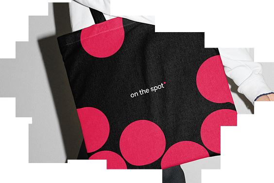
Pattern
The geometric module that shapes the logo and accent typography became the foundation for the brand’s pattern system. We developed an adaptive pattern built from “soft pixels” that captures the living, breathing energy of the community and the spirit of co-creation.
Its ability to transform into recognizable shapes, such as a heart or lightbulb, reflects the value of discovery and insight born from interaction. At the same time, its scalability allows it to work equally well as an energetic background or a tactile texture across all brand materials.
.png)
The result
The new identity gives Productlab a stronger, more cohesive visual presence that reflects the brand’s core values: community, collaboration, and growth. The redesigned logo, typography, and adaptive pattern system work together to create a modern, recognizable brand that feels both professional and human.
More importantly, the redesign is not just a visual upgrade — it's the outcome of a deliberate brand identity redesign process that helped Productlab communicate its purpose and attract the right audience. Thoughtful branding turns product experiences into meaningful connections, and design creativity makes those connections feel real and memorable.
While we focus on product management, taste, design, and a human touch are central to what we do. This is why choosing INSAIM was a great decision.
How to redesign a brand identity for a community is a different problem than redesigning for a product. People aren't users here — they're the brand.