.svg)
.png)
.svg)
.svg)
.svg)


Most brand guidelines end up as a 40-page PDF that gets opened once, during handoff, and never again. This guide covers a leaner way to do it: the handful of decisions that actually need documenting, the order to make them in, and how to package the result as a brand guidelines PDF someone will actually reach for six months from now.
What brand guidelines actually need to cover
A logo file is not brand guidelines — it’s one asset inside them. Real brand guidelines translate strategy into rules other people can apply without asking you first: how the logo behaves in different contexts, which colors are allowed together, how type is used at different sizes, and what the brand sounds like in writing.
At minimum, that means covering five things: logo usage and clear space, the color palette (with exact values, not just swatches), a type hierarchy, an imagery or iconography style, and a voice-and-tone section for anyone writing copy. Everything past that — social templates, packaging rules, motion guidelines — is worth adding only once the core five are solid and actually being used.
Step 1: Start from strategy, not from the logo
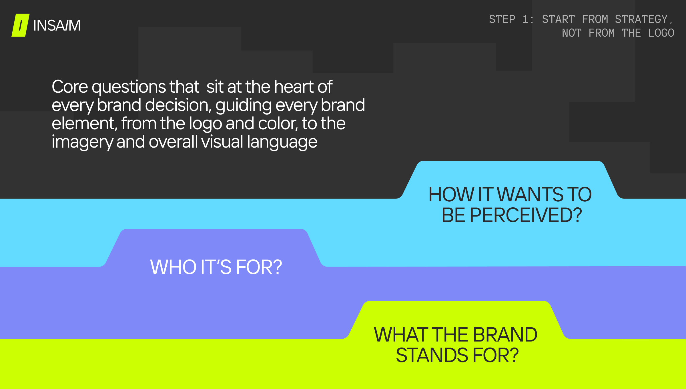
Brand guidelines documented before the underlying strategy is settled tend to describe decisions nobody can explain later. Before touching color palettes or type specimens, get one paragraph of agreement on what the brand stands for, who it’s for, and how it wants to be perceived against competitors.
This doesn’t need to be a lengthy positioning exercise. It needs to be specific enough that a design decision can be checked against it — “playful but not childish, for technical buyers who are skeptical of hype” is usable; “innovative and customer-focused” is not.
Step 2: Document the visual system with exact values, not vibes
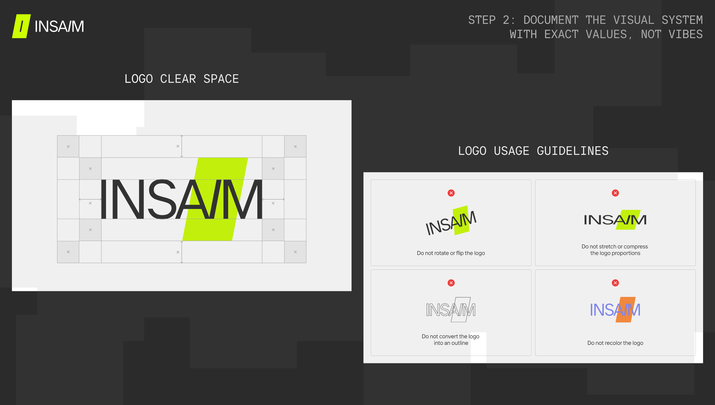
This is the section people expect: logo variations (primary, reversed, icon-only, minimum size), the color palette in HEX, RGB, and CMYK, the type hierarchy for headings and body text, and the visual language for photography or illustration. The difference between guidelines that get used and ones that don’t usually comes down to precision here — “our blue” is not a value anyone can paste into a design file; a HEX code is.
Include real do-and-don’t pairs for the logo specifically: how much clear space it needs, what backgrounds it can and can’t sit on, and the specific distortions or recolors that are off-limits. A useful pattern here is defining clear space as a fraction of the mark’s own height rather than a fixed pixel value, so the rule still holds at any size — and listing the actual mistakes a team is likely to make (rotating the mark, stretching it, adding a drop shadow, recoloring it outside the two approved variants) rather than a generic “don’t misuse the logo” warning. The same precision applies to color: a single palette swatch isn’t enough once the brand shows up on dark backgrounds, gradients, or over photography — a working system needs a tint scale for each core color (10% through 100%), not just one hex value per color.
Step 3: Anchor everything to one metaphor
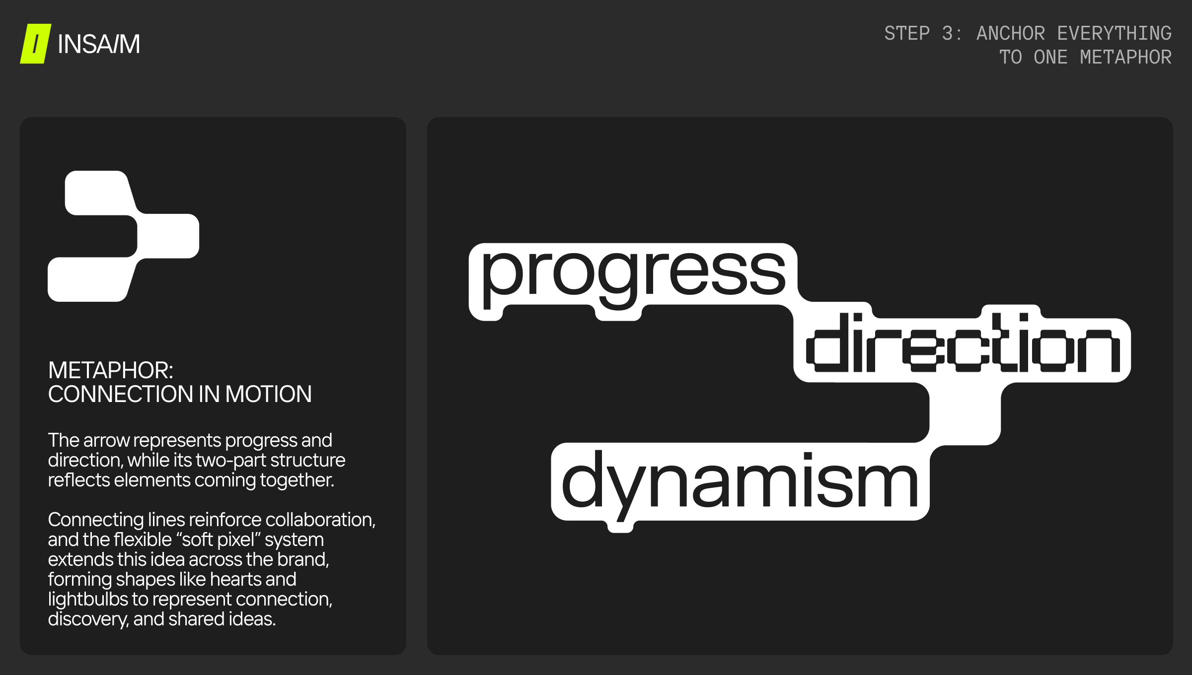
A brand that feels disjointed across a website, a support email, and a pitch deck reads as unstable even when the logo is used correctly everywhere. Picking one central metaphor and running it through everything — the way a feature gets named, the way a page is structured, the images chosen, the words used to explain a benefit — is what keeps that from happening.
A logistics platform built around "the control tower" will name its dashboard, write its onboarding copy, and pick its icons differently than one built around "the co-pilot" — even if the two products do almost the same thing. The metaphor gives anyone writing a new page or naming a new feature something concrete to check their instinct against, instead of guessing at what "feels on-brand."
Test the metaphor against more than the hero section before locking it in — a landing page headline, an onboarding email, a piece of UI microcopy. If it only holds up in one of those places, it isn't load-bearing enough to guide the rest of the guidelines.
Step 4: Package it as one reference document, not a design portfolio
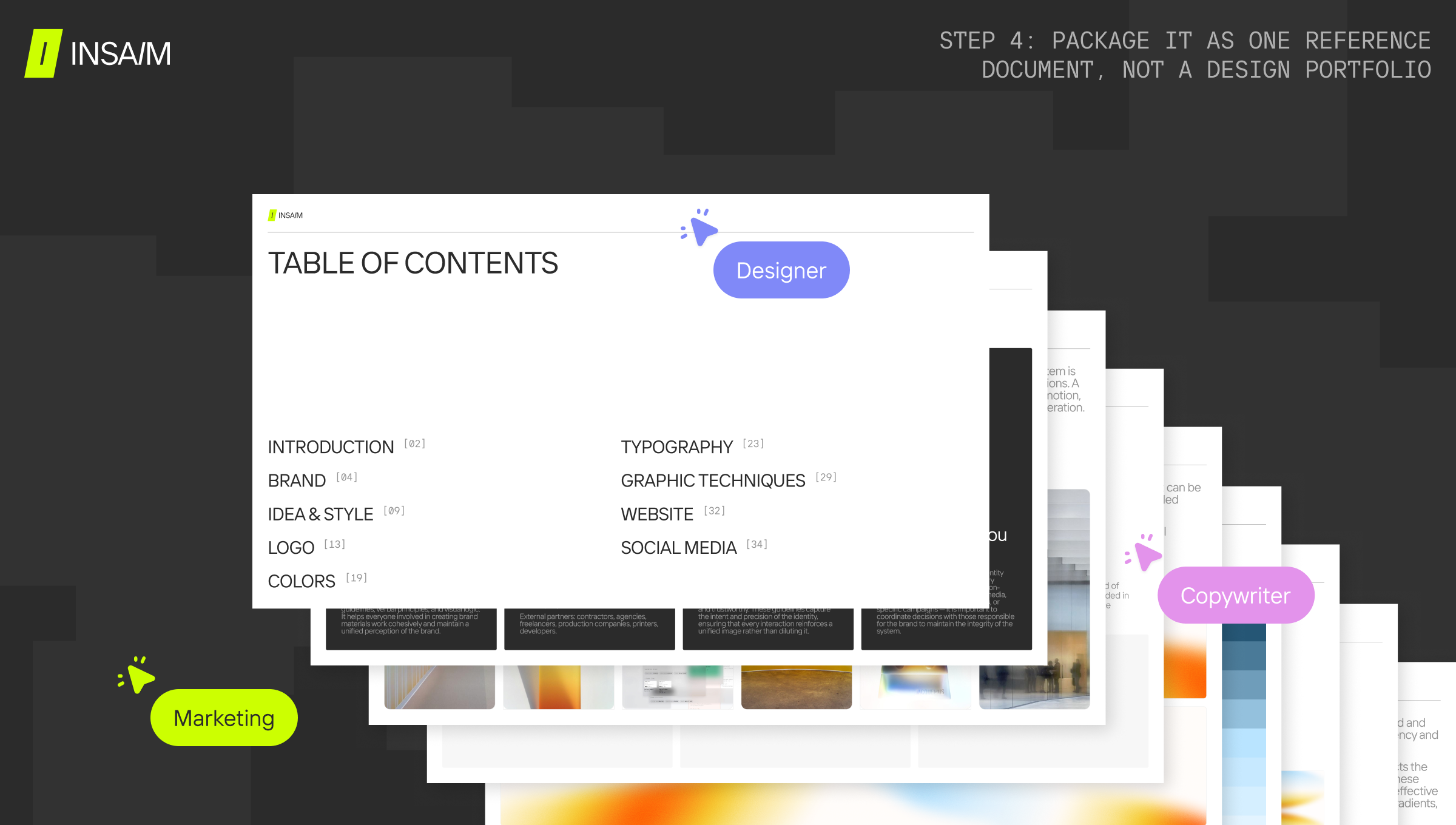
Once the pieces above exist, the packaging step is what determines whether anyone opens the document again. A brand guidelines PDF works best as a single, skimmable reference — one page per topic, real examples over abstract descriptions, and a table of contents if it runs past ten pages. Anyone who needs to use the brand — a new hire, a freelancer, an ad agency — should be able to find the one rule they need in under a minute, not read the whole thing front to back.
Keep the sections in the order they were decided — strategy summary, logo system, color and type, imagery, metaphor — so updating one section later doesn't force a rewrite of everything before it.
Why brand guidelines get ignored (and how to prevent it)
The most common failure mode isn't bad guidelines — it's guidelines nobody remembers exist. Three patterns show up repeatedly: the document lives in a folder nobody checks instead of inside the actual design and content tools people use daily; it was written once at launch and never updated as the product or team grew; or it documents aspirational rules that don't match how the brand is actually being used in practice, which trains people to ignore it.
The fix for all three is the same: keep the document short enough to actually reference, put it somewhere the team already works (a pinned Figma page, a shared drive linked from onboarding, not a standalone PDF attachment), and revisit it after any significant rebrand or new product line rather than treating it as a one-time deliverable.
When it’s worth bringing in outside help
Internal teams can absolutely maintain guidelines once the core system exists. Where outside brand book design help tends to pay off is earlier — at the point of first defining the visual and verbal system, when there isn't yet an internal design lead to make and defend those calls, or during a rebrand where the existing identity needs to be reconciled with years of inconsistent internal use. A good outside process usually adds two things an internal team rarely has time to do on its own: naming the underlying design concept in a word or two — something a designer can hold onto when making the hundredth small decision later — and stress-testing that concept as a metaphor across a handful of different materials (a landing page, an ad, a piece of UI copy) before locking it in, rather than assuming it holds up everywhere because it worked for the hero section.
FAQ
What is the 3-7-27 rule of branding?
It’s a rule of thumb about exposure, not a formatting rule for guidelines: it suggests a brand needs roughly 3 seconds to register, 7 exposures to be remembered, and 27 to build real trust. It’s a useful reminder that consistent guidelines matter because of repeated exposure, not because of any single polished touchpoint.
What should be included in brand guidelines?
At minimum: logo usage and clear space, an exact color palette (HEX/RGB/CMYK), a type hierarchy, an imagery or iconography style, and the central metaphor that ties copy, naming, and visuals together. Everything beyond that — social templates, packaging, motion — is worth adding once those five are solid.
What’s the importance of brand guidelines once a team starts to grow?
In practice the terms are used interchangeably, though “brand book” sometimes implies a more polished, narrative-driven document (the brand’s story and positioning alongside the visual rules), while “guidelines” can be a leaner, purely functional reference. Either works as long as it’s actually usable day to day.
What’s the importance of brand guidelines once a team starts to grow?
Once more than one person is making design or content decisions, undocumented brand instincts stop scaling — what looked consistent with one person deciding everything starts drifting the moment a second designer, a freelancer, or a new hire joins without the same context.
Where can I find brand guidelines examples to reference?
Well-known public brand guidelines from companies like Spotify, Google, and Duolingo are widely available online and are useful for seeing structure and tone, though they’re built for organizations with far larger design teams — a startup’s guidelines should be a fraction of the length and focus on the handful of rules that get used weekly.