.svg)
.png)
.svg)
.svg)
.svg)


The pricing page is often the last screen a visitor sees before they decide. They either become a customer, or they leave and never come back — which is exactly why SaaS pricing page design deserves the same care as the rest of the product.
Median pricing page conversion for SaaS companies typically sits around 3–5% for free trials, and 2–3% for direct paid signups. Even a small amount of confusion at this one step can quietly cap growth — before marketing or sales ever gets involved.
Unlike a landing page, most visitors arriving on a pricing page already understand what the product does. Their question isn't "what is this?" It's "which plan is right for me, and is it worth it?"
In this guide, we walk through what separates a pricing page that converts from one that quietly loses customers, look at some of the best SaaS pricing pages live today — Framer, Notion, Slack, Stripe, and others — and outline the practical patterns behind them.
This article builds on our related guides to best B2B SaaS websites and high-converting SaaS product pages — the pricing page is usually the final step in that same evaluation journey.
What Makes a Great SaaS Pricing Page
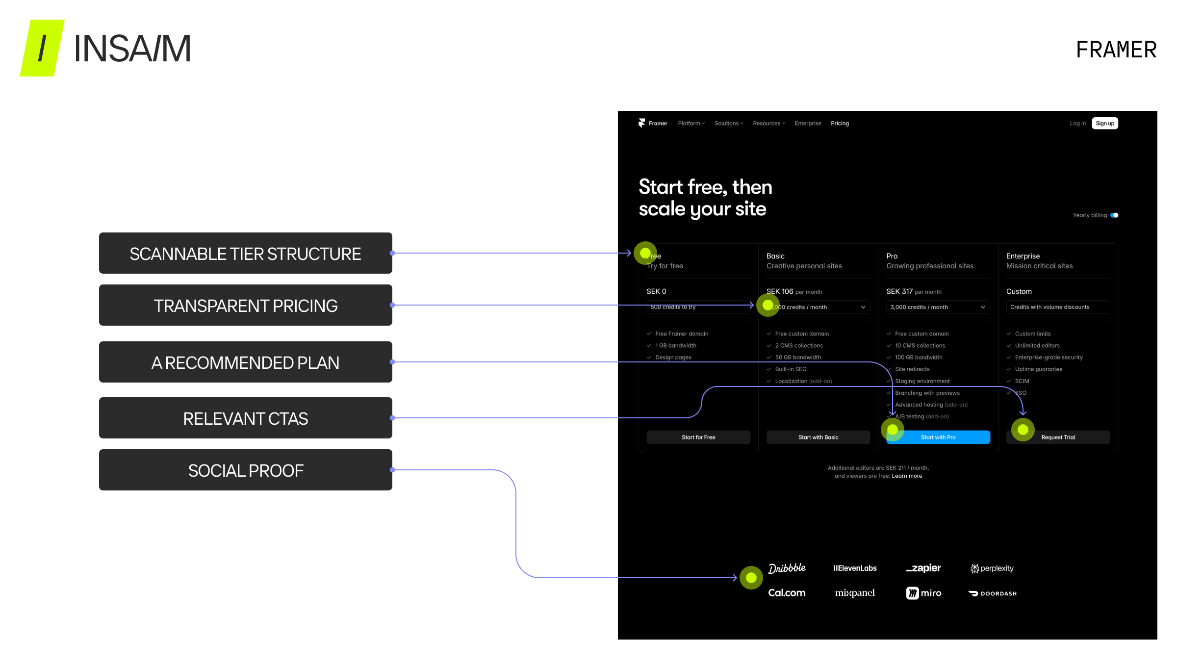
- Clear, Scannable Tier Structure. Most visitors don't read a pricing page top to bottom — they scan it looking for the differences between plans. Three to four tiers is generally the sweet spot: fewer feels incomplete, more creates decision paralysis.
- A Recommended Plan. Highlighting one tier as "Most Popular" or "Recommended" gives undecided visitors a default choice and measurably reduces the effort needed to decide, often lifting conversion without any change to the underlying price.
- Transparent Pricing Where Possible. For self-serve SaaS products, showing real numbers builds trust and speeds up evaluation. Hidden or "Contact us" pricing generally only makes sense for enterprise-tier plans with custom scope, not for a product's primary tiers.
- CTAs Matched to the Buying Motion. "Start free trial" fits self-serve tiers; "Contact sales" fits enterprise tiers. Mismatching the two — asking a self-serve buyer to book a call, or an enterprise buyer to self-checkout — adds friction at the exact moment someone is ready to convert.
- Mobile-First Layout. A large share of pricing page traffic arrives on mobile, where a three-column tier table often breaks down. Plans need to stack cleanly, with the recommended tier surfaced first rather than buried in a horizontal scroll.
- Social Proof Near the Decision Point. Logos, testimonials, or customer counts placed close to the pricing table reduce hesitation right where it matters most, rather than sitting isolated elsewhere on the page.
A pricing page shouldn't try to close the sale by itself. It should remove enough friction and confusion that saying yes feels obvious. The best SaaS pricing pages guide a decision instead of forcing visitors to do the comparison work themselves
SaaS Pricing Page Examples
Notion
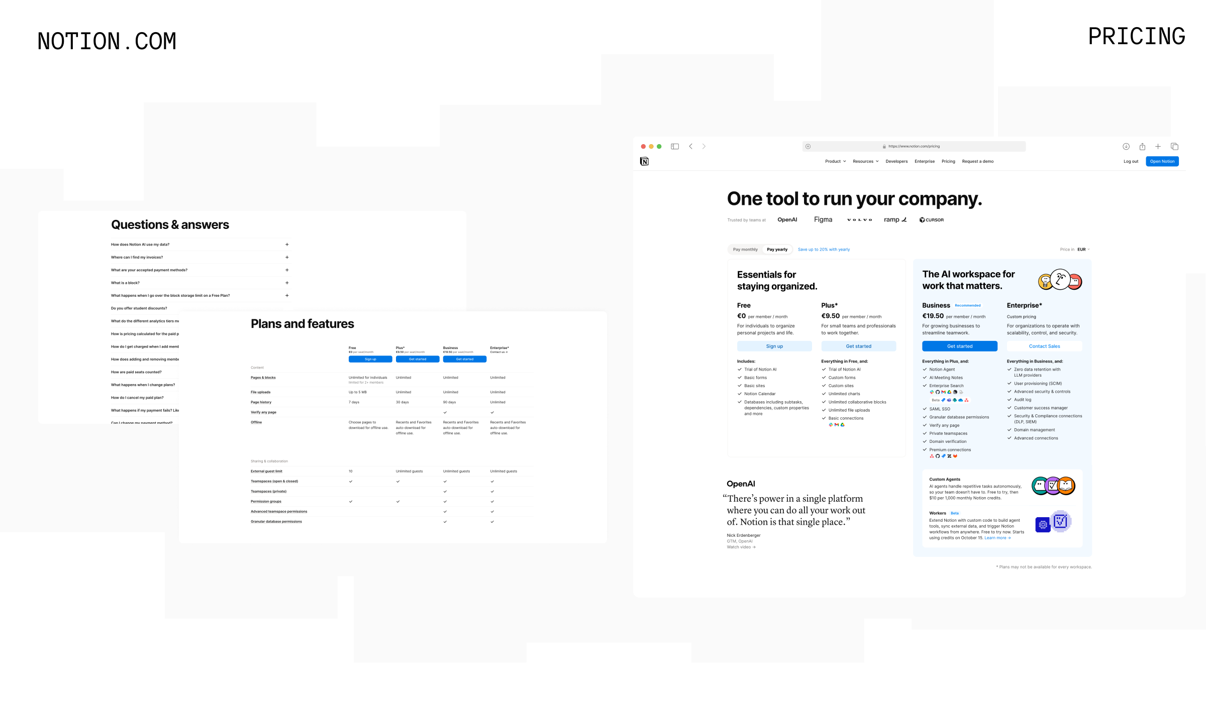
Notion's pricing page pairs an outcome-driven headline ("One tool to run your company") with a plan layout where the Business tier carries a "Recommended" tag and sits on a visually distinct card, separated from the lighter Free and Plus cards.
Design insights:
- Recommended plan set apart with its own card treatment, not just a small badge
- Customer logos (OpenAI, Figma, Volvo, Cursor) shown immediately below the headline for early trust-building
- A full "Plans and features" comparison table sits below the pricing cards for visitors who want more detail
- Dedicated "Questions & answers" accordion placed directly under the pricing content, not on a separate page
Slack
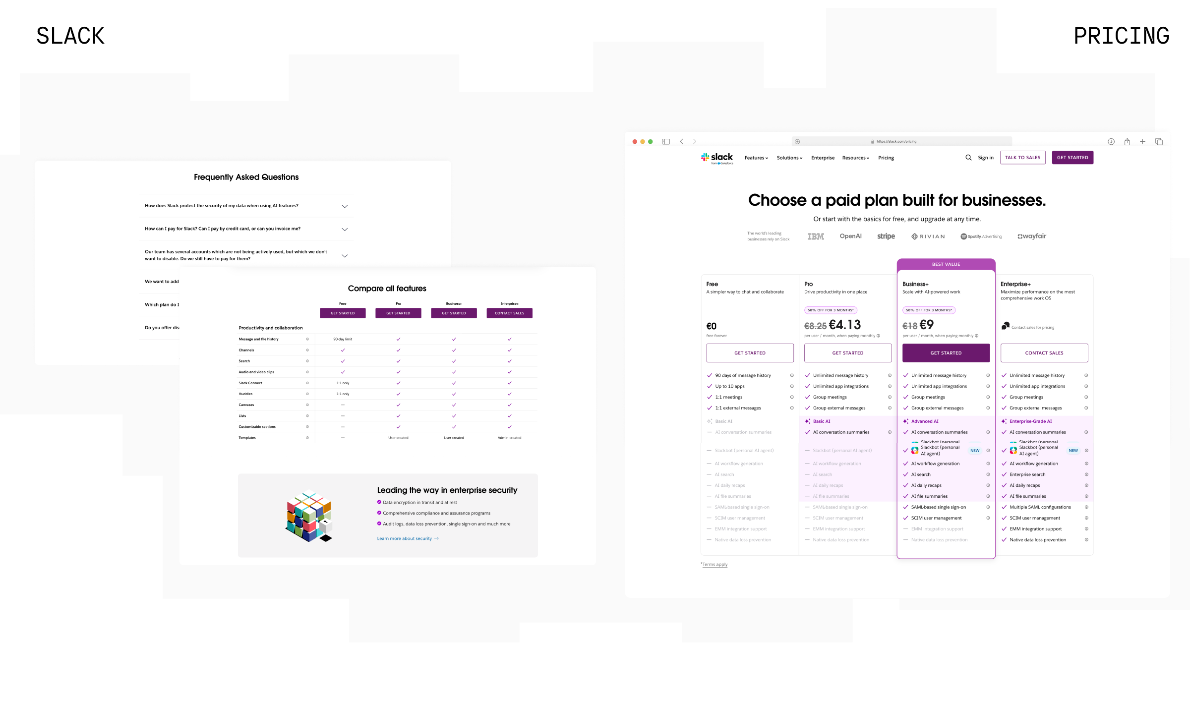
Slack's pricing page uses a four-tier layout with Business+ called out by a purple "BEST VALUE" ribbon and a filled card style, while limited-time discount pricing — the original price struck through next to the new one — creates urgency without a separate banner.
Design insights:
- A ribbon plus a distinct card color make the recommended tier unmissable at a glance
- Discounted pricing shown as strikethrough-original next to the new price, directly inside the tier card
- Detailed "Compare all features" table sits beneath the tiers, organized by feature category
- FAQ addressing billing and security questions placed directly below the comparison table
Stripe
Stripe handles a genuinely complex, usage-based product by leading with the simplest possible entry point — a flat per-transaction rate under "Standard" — and offering a separate "Custom" path for volume-based and multi-product pricing, keeping the first decision simple.
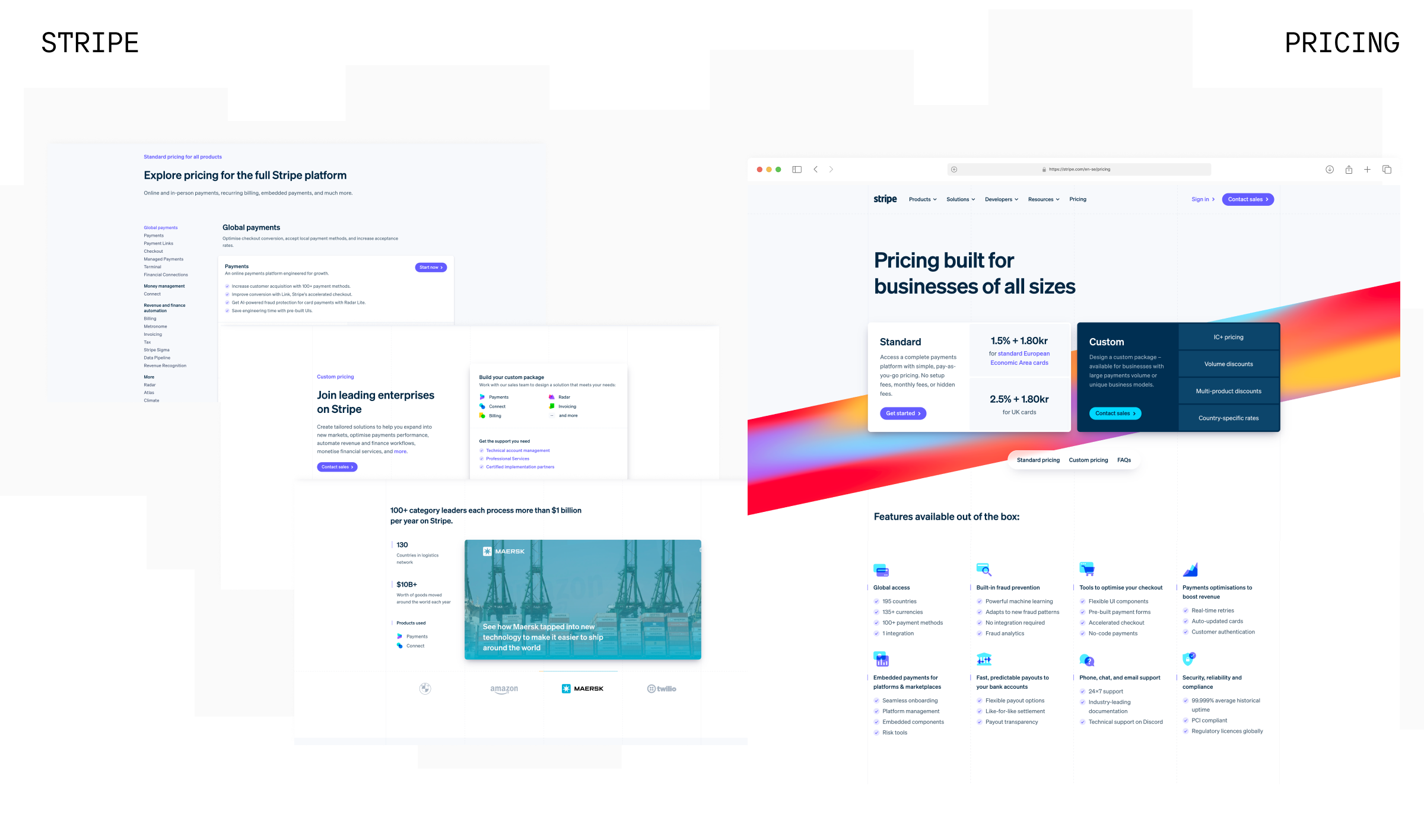
Design insights:
- A two-option primary choice (Standard vs. Custom) avoids overwhelming first-time visitors
- A sitemap-style sidebar lets visitors jump straight to pricing for any individual product
- Feature availability grouped into themed icon sections (fraud prevention, checkout, payouts, compliance) instead of one giant table
- Customer proof shown as a case-study callout (Maersk) rather than a plain logo strip
Webflow
Webflow keeps two genuinely different pricing decisions — Site plans and Platform plans — in visually separate sections, and layers optional add-ons (Optimize, Analyze, Localize) below the core tiers instead of folding them into the main comparison.
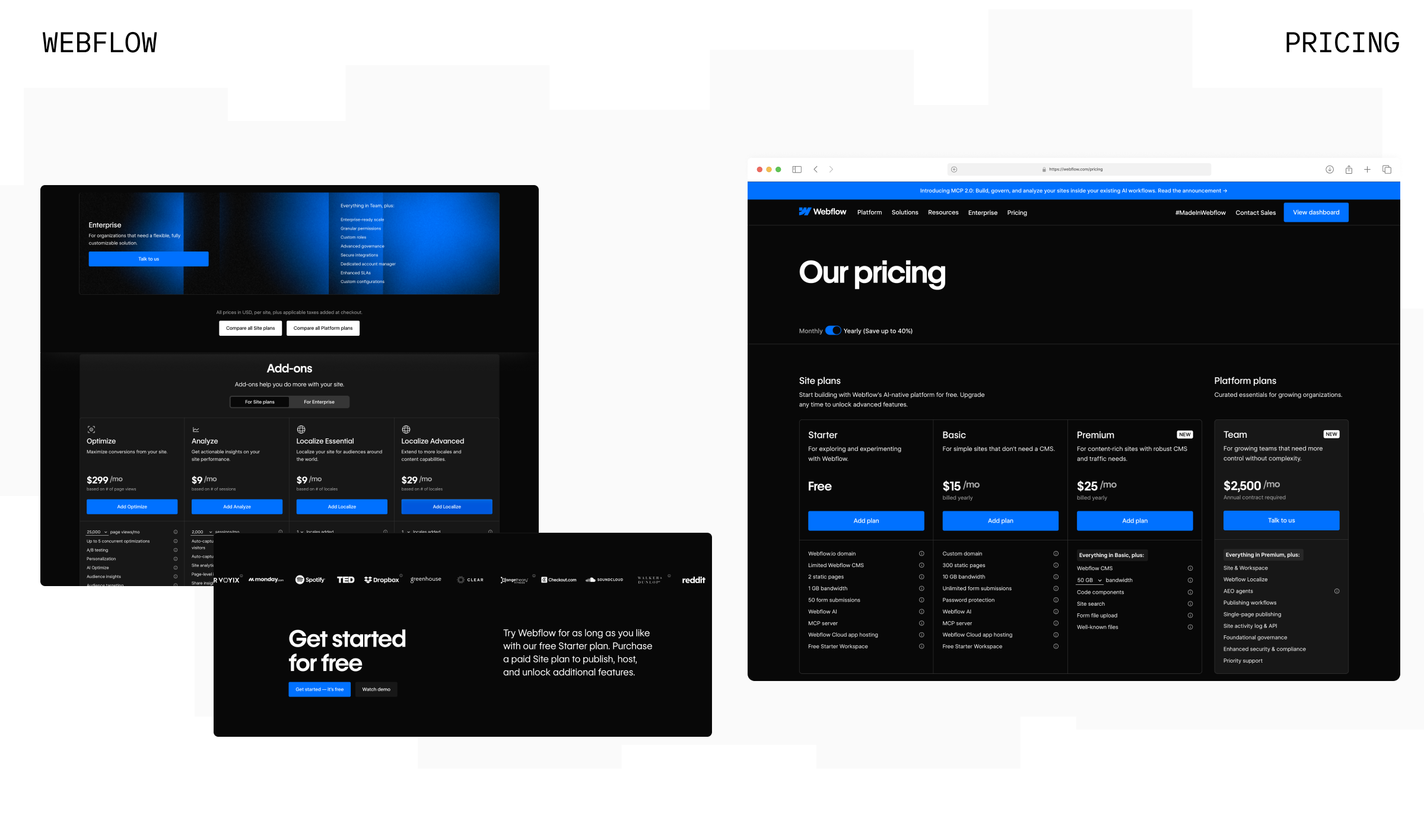
Design insights:
- Site plans and Platform plans kept structurally separate so two different buying decisions never collide
- Monthly/yearly toggle states the savings explicitly ("Save up to 40%")
- Add-ons priced and displayed independently, keeping the core tier comparison uncluttered
- A dedicated "Get started for free" banner reinforces the entry-level CTA after the pricing tables
HubSpot
HubSpot opens its pricing page with a product selector (Marketing, Sales, Service) before showing any tiers, and pairs its Professional plan with two CTAs — "Build your Plan" and "Talk to Sales" — to serve self-serve and sales-assisted buyers on the same card.
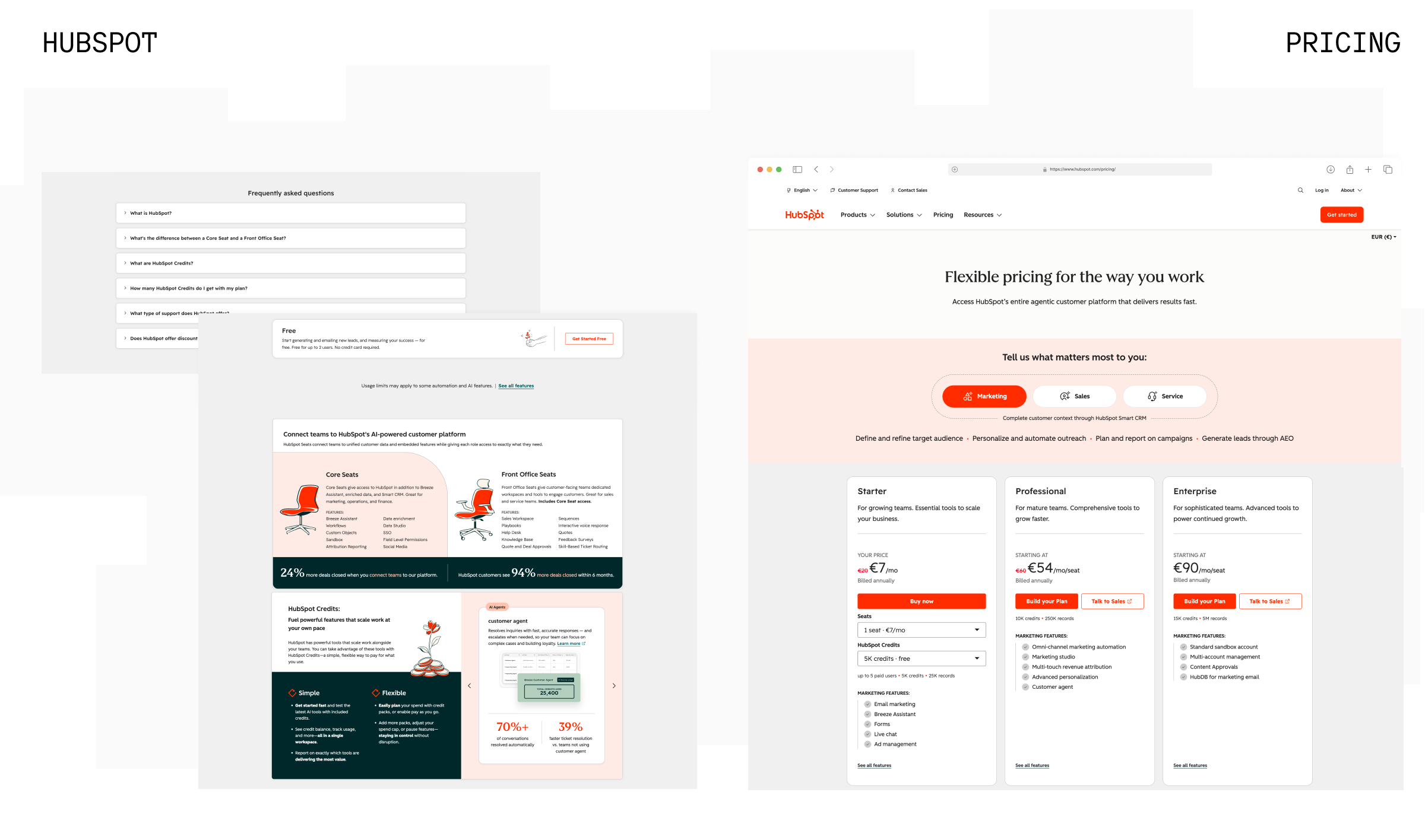
Design insights:
- Use-case selector shown before pricing tiers, so visitors only compare plans relevant to them
- Dual CTAs on the mid-tier plan accommodate both self-serve and sales-led buying motions
- Strikethrough discounted pricing shown directly on the tier cards
- Concrete outcome stats ("94% more deals closed within 6 months") placed near the pricing explanation to reinforce value
Zapier
Zapier's pricing page includes an interactive "How many tasks do you need?" slider that lets visitors estimate their own usage before committing to a tier, turning an abstract, usage-based pricing model into something tangible.
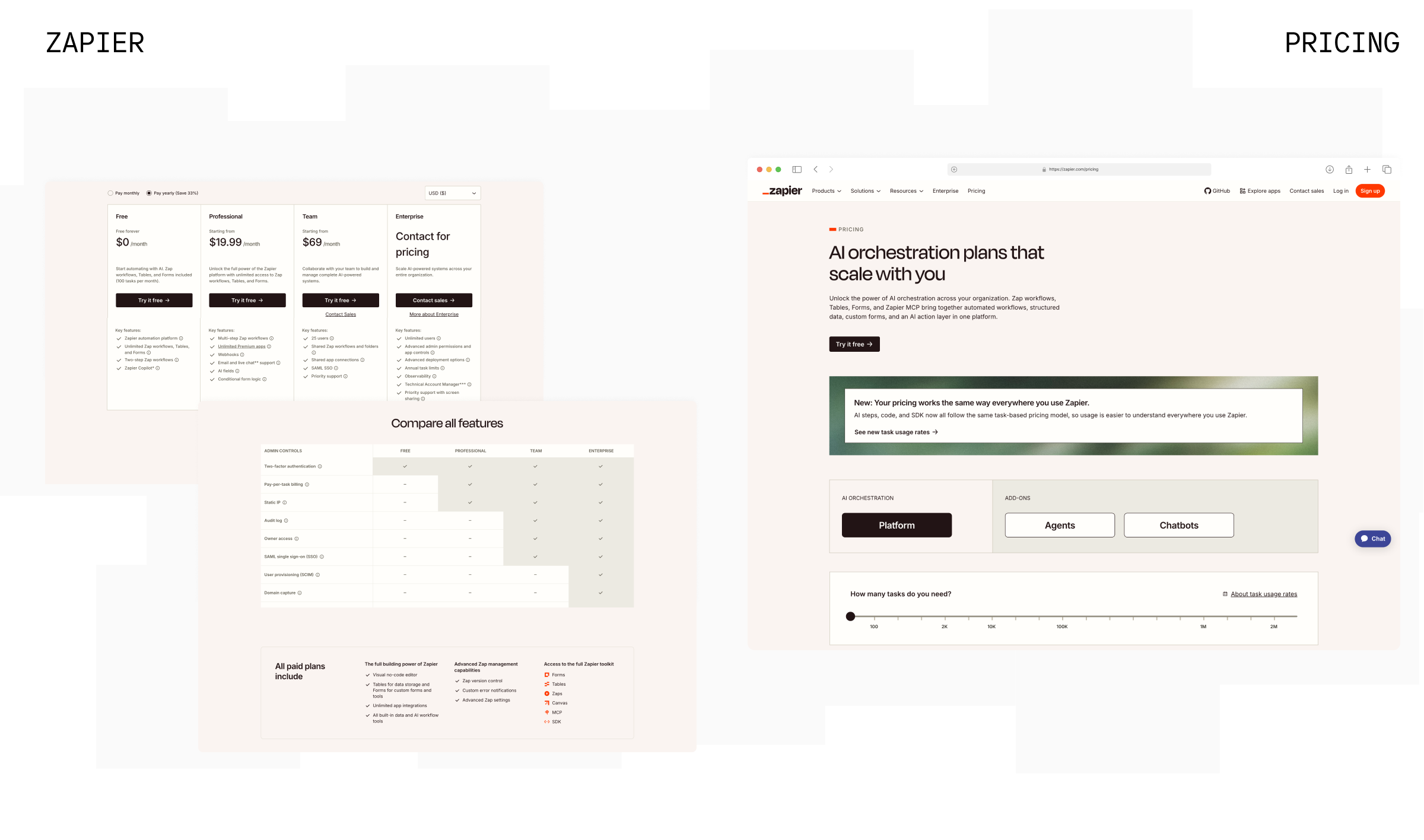
Design insights:
- An interactive usage slider answers "how much will this actually cost me" directly on the page
- Tiers described with a "starting from" price to account for usage-based variability
- Separate tabs for the core platform vs. add-ons (Agents, Chatbots) keep the primary comparison simple
- A dedicated banner proactively explains a recent pricing model change, heading off visitor confusion
Airtable
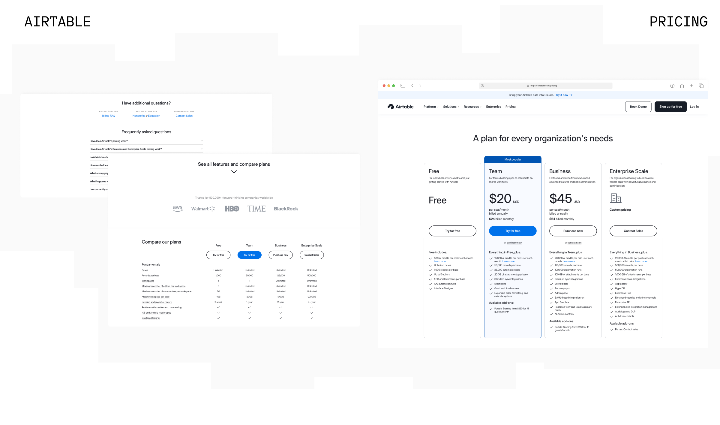
Airtable highlights its Team plan with a blue "Most popular" badge and a filled CTA button against three outlined ones, keeping the visual hierarchy simple — four cards, one clearly recommended — before a detailed "Compare our plans" table further down the page.
Design insights:
- "Most popular" badge plus a filled CTA button doubles down on the recommended plan
- Enterprise-grade customer logos (AWS, Walmart, HBO, BlackRock) placed directly under the pricing cards
- Full feature comparison table collapsed by default, keeping the initial view focused
- FAQ split into general questions plus a link out to a separate, more detailed billing FAQ
ClickUp
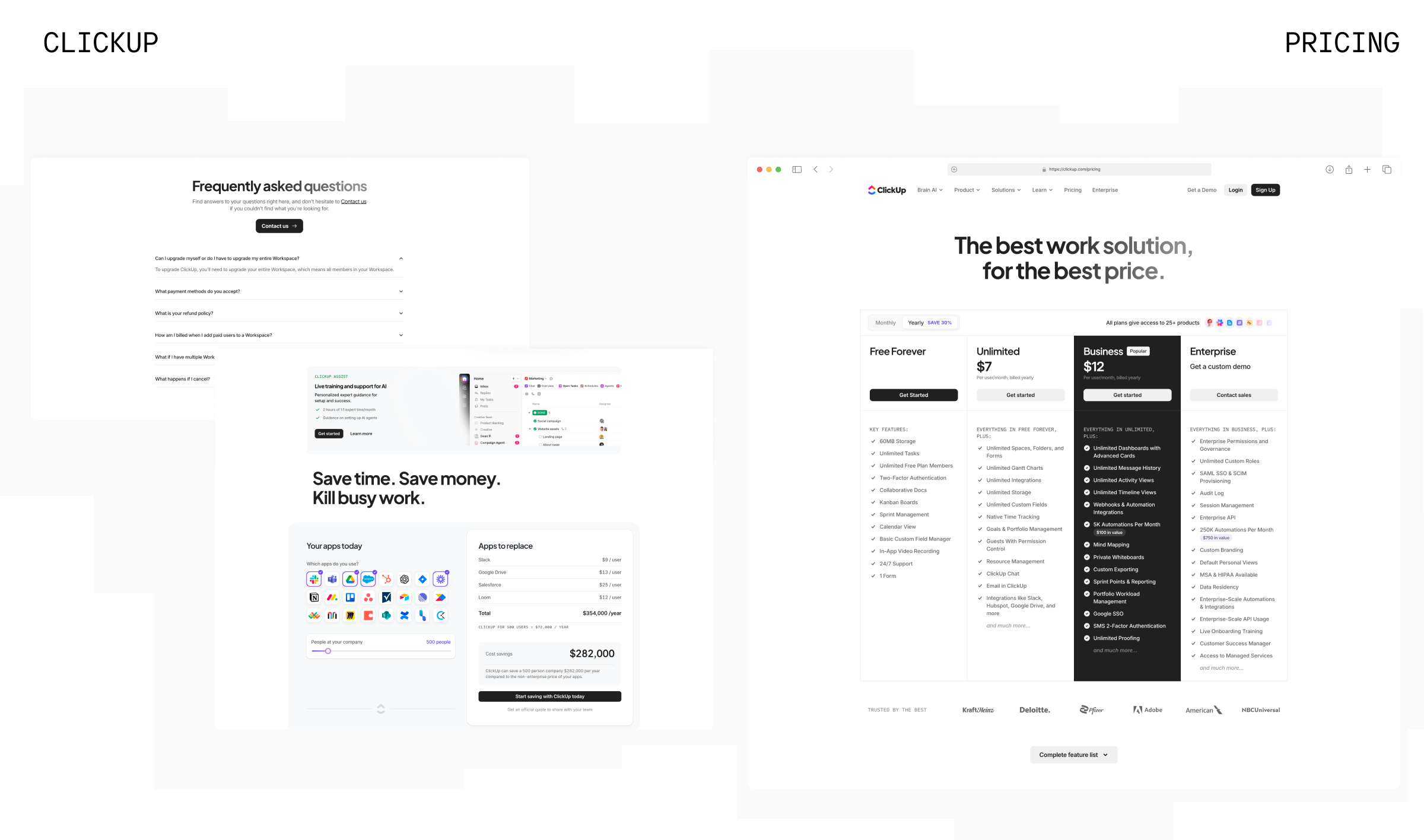
ClickUp pairs its pricing table with a built-in "Apps to replace" calculator that estimates a visitor's current tool-stack cost and shows the potential savings from switching, turning the pricing page into a persuasive tool rather than a static table.
Design insights:
- An interactive savings calculator gives visitors a personalized number instead of an abstract value claim
- Business tier set apart with a dark, filled card and a "Popular" badge
- Monthly/yearly toggle states the discount explicitly ("Save 30%")
- Enterprise-grade logos (Adobe, Deloitte, NBCUniversal) placed at the very bottom, reinforcing scale right before the FAQ
Best Practices for Designing SaaS Pricing Pages
A handful of patterns hold across nearly every high-converting pricing page:
- Keep it to three or four tiers. Fewer feels incomplete; more creates decision paralysis. If you have more than four real plans, group or hide the less common ones behind a toggle.
- Highlight exactly one recommended plan. A single visual cue — a badge, a border, a slightly larger card — gives undecided visitors a default without requiring them to compare everything themselves.
- Match CTA language to the buying motion. Self-serve tiers should say "Start free trial" or "Get started"; enterprise tiers should say "Contact sales" or "Talk to us." Mixing the two confuses both audiences.
- Design for mobile first. With a large share of pricing traffic on mobile, tiers need to stack cleanly with the recommended plan surfaced first, not left at the end of a horizontal scroll.
- Put the FAQ directly below the pricing table. Every unanswered question is a reason to leave and "come back later." Address billing, cancellation, and plan-switching questions right where the hesitation happens.
- Use social proof near the decision. Not just elsewhere on the site. Logos or testimonials placed close to the CTA do more work than the same content sitting in a separate section.
- Treat the page as a conversion system, not a spreadsheet. Pricing pages benefit from ongoing testing — tier framing, CTA copy, and highlighted plan are all worth iterating on with real usage data.
A pricing page shouldn't try to close the sale by itself — it should remove enough friction and confusion that saying yes feels obvious. The best SaaS pricing pages guide a decision instead of forcing visitors to do the comparison work themselves.
At INSAIM, we design pricing pages as part of the full SaaS conversion journey, from first landing page impression through the final plan decision. If your pricing page isn't converting the way your product deserves, get in touch or book a call with our team.

FAQ
- How many pricing tiers should a SaaS pricing page have?
Three to four tiers is generally ideal. Fewer than three can feel incomplete or limit flexibility, while more than four tends to create decision paralysis. If you need to offer more plans, consider grouping less common options behind a toggle or a "compare all plans" link. - Should I hide my pricing or show it publicly?
For most self-serve SaaS products, showing transparent pricing builds trust and speeds up evaluation. Hiding pricing generally only makes sense for enterprise plans with custom scope, where the price genuinely depends on a conversation. - What CTA should I use on a SaaS pricing page?
Match the CTA to the buying motion. Self-serve tiers should use action-oriented language like "Start free trial," while enterprise or custom tiers should use "Contact sales" or "Talk to our team." Using the wrong CTA for a tier adds friction at the point of decision. - Does highlighting a "recommended" plan actually improve conversion?
Yes, where feasible. Highlighting one plan gives undecided visitors a default choice, reducing the mental effort required to compare every option and generally improving conversion without any change to the underlying price. - How important is mobile design for a pricing page?
Very. A large share of pricing page traffic happens on mobile. If a three-column tier layout doesn't stack cleanly on smaller screens, a significant share of potential conversions can be lost before visitors even finish comparing plans.