.svg)
.png)
.svg)


Symptom tracking is a core feature of modern health tracker apps and, unsurprisingly, one of the defining elements of the best symptom tracker app. Whether users are managing chronic conditions, mental health, or just trying to remember if they had enough sleep last night, efficient symptom logging is critical for both patients and healthcare providers. A thoughtfully designed logging flow not only improves usability but also demonstrates how UX/UI design can improve patient engagement, encouraging regular input and long-term adherence.
We analyzed multiple healthcare and wellness apps and here are ten varied symptom logging flows, highlighting differences in step structure, personalization, and interaction patterns. From this comparison, you can see that flows with step-by-step symptom input, clear progress feedback, logical grouping, and flexible customization consistently drive the highest engagement. Conversely, flows with long, unstructured lists, unclear exit points, or rigid symptom selection tend to confuse users and reduce consistency.
This article acts as a mobile health symptom tracker UX/UI guide, presenting symptom logging user experience best practices and insights on how to design symptom tracking flows. It demonstrates user-centered symptom tracker flow design and shows how symptom tracker personalization features UX and symptom input optimization can maximize engagement and retention.
For broader insights on structured flows in apps, check out our UX design frameworks overview, which highlights strategic models behind successful digital products.
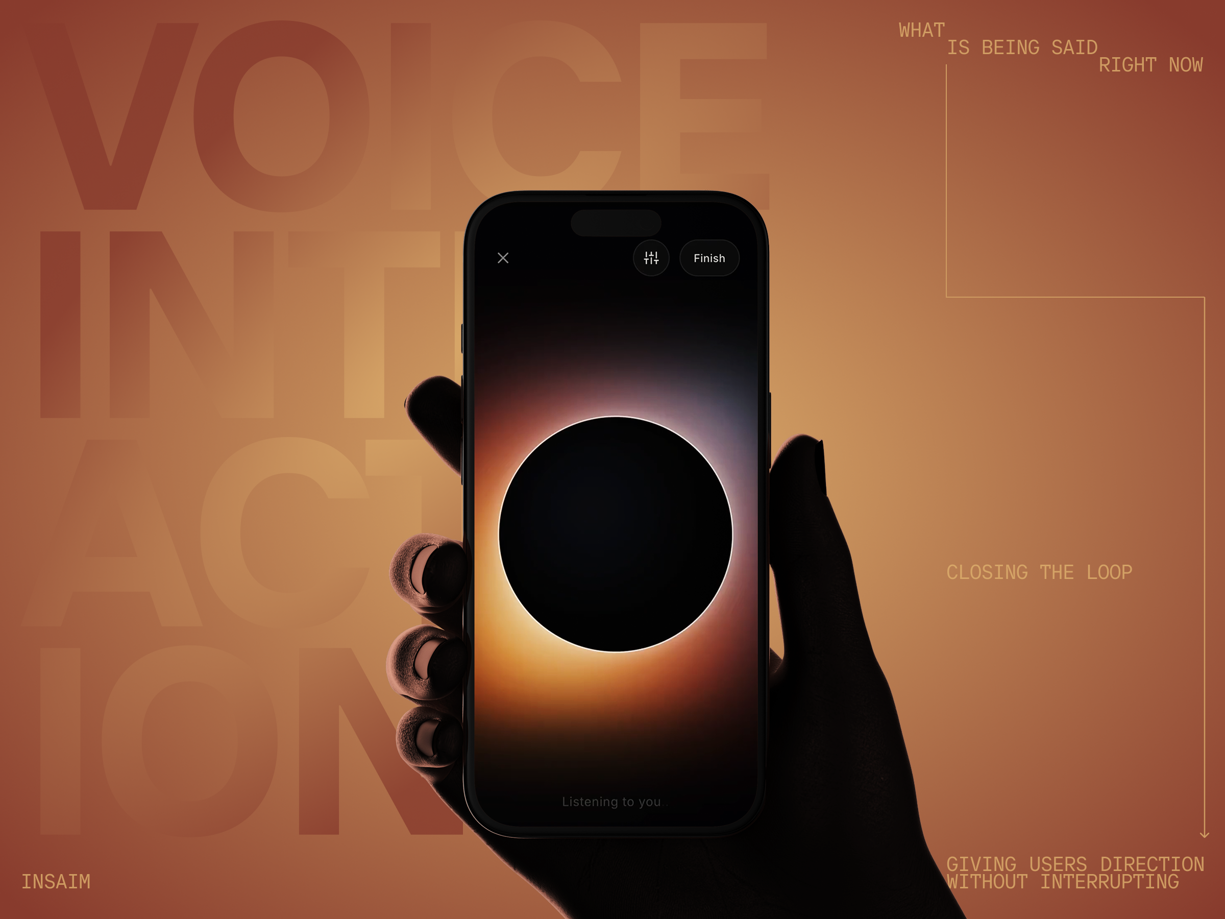
Why UX/UI Matters in Symptom Logging
In medical mobile app design, the symptom logging experience is where habit formation and meaningful engagement begin. Effective UX/UI design that improves patient engagement ensures users feel in control, reduces cognitive effort, and captures emotional context appropriately. Across multiple analyses of symptom tracker apps, one insight is clear: it’s not about collecting more data, but about crafting intuitive, actionable logging flows that optimize the user experience UX for patient engagement.
High-performing symptom logging flows tend to combine structured step-by-step interactions, clear navigation, progress indicators, and visible completion states. They allow users to customize their experience by adding, removing, or reordering symptoms, while presenting logical groupings with consistent color coding and familiar, recognizable UI patterns. Some even integrate with external trackers to enrich the user’s data. On the other hand, poorly designed flows often present long, unstructured symptom lists with unclear grouping logic, prioritize branding over usability, hide the completion action, or offer limited personalization despite high interaction effort.
Cross-Flow Insights: Success vs Failure
Successful logging flows reduce cognitive load by structuring the interaction. Users progress logically through steps, see their previous answers, and can navigate back or skip optional steps as needed. Personalization plays a critical role: the ability to add new symptoms or groups, remove irrelevant items, reorder frequently used symptoms, or incorporate body-based emotional input increases engagement and retention. Conversely, apps that fail to provide these features often feel overwhelming and low-value, which discourages consistent logging and reduces the perceived utility of the symptom tracker.
Examples: Analyzing Symptom Logging Flows
Takeaways
1. Structure Reduces Anxiety
Step-based logging flows provide a clear step‑by‑step symptom tracker design, helping users complete input efficiently. Logical sequencing, visible progress, back navigation, and optional skip steps make users feel in control and less overwhelmed. Each step should balance clarity, depth, and perceived outcome value to reinforce user-centered symptom tracker flow design.
2. List Size & Organization Are Critical
Unstructured symptom lists create cognitive friction, even with search, icons, or color coding. Semantic grouping (Mood, Pain, Energy, Sleep), expandable sections, search, consistent color coding, and alphabetical fallback optimize health app symptom input. Clear taxonomy enhances trust and supports user experience UX for patient engagement.
3. Personalization Drives Retention
Customization is a key driver of retention and perceived value. Effective logging flows allow users to add new symptoms or groups, remove irrelevant items, reorder frequently used options, integrate body-based emotional input, and connect external trackers. Flows that preselect all symptoms or limit personalization reduce engagement. Leveraging symptom tracker personalization features UX ensures that the app adapts to each user’s needs, improving engagement in symptom tracker apps.
4. Clarity Over Decoration
Usability should always take precedence over aesthetics in medical mobile app design. Positive design signals include large, visible buttons, familiar interaction patterns (checkboxes, radio buttons, toggles), clean layouts, and meaningful animation or haptic feedback. A clear logging interface design directly supports UX/UI design to improve patient engagement and reinforces a mobile health symptom tracker UX/UI guide.
5. Emotional Layer: Powerful but Sensitive
Color-coded emotion mapping, body-based selection, haptic feedback, and integration into the symptom logging flow enhance engagement without overcomplicating the user experience. Avoid imposed emojis, overly exploratory searches, and stylized representations that reduce authenticity. Emotion UX should empower users while maintaining clarity.
6. Completion & Exit States Influence Engagement
Hidden “Done” buttons, unclear exit points, and empty states with no guidance hinder consistent logging. Best practices include clear call-to-action buttons, contextual guidance, and predictable exits to reinforce engagement. Following these principles forms a complete step‑by‑step symptom tracker design, part of the best practices for symptom tracking in health apps.
For more insights on UX/UI design and digital product development beyond symptom logging, check out our other articles — for example, our app menu page ideas and best practice examples, which explores different examples of app menu layouts.
UX/UI Principles for Building the Best Symptom Tracker App
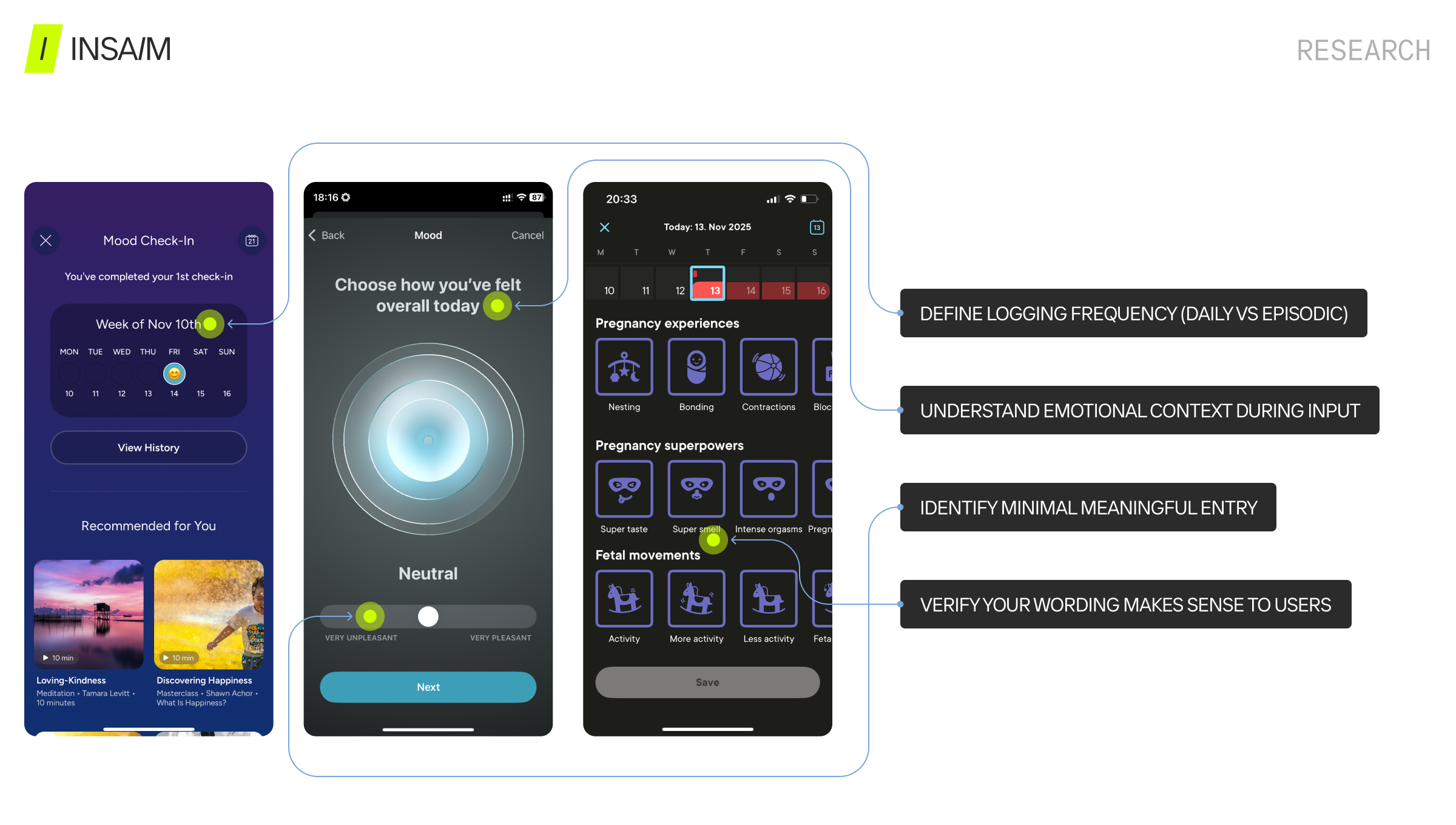
Research
- Define logging frequency (daily vs episodic)
- Understand emotional context during input
- Identify minimal meaningful entry
- Test terminology comprehension
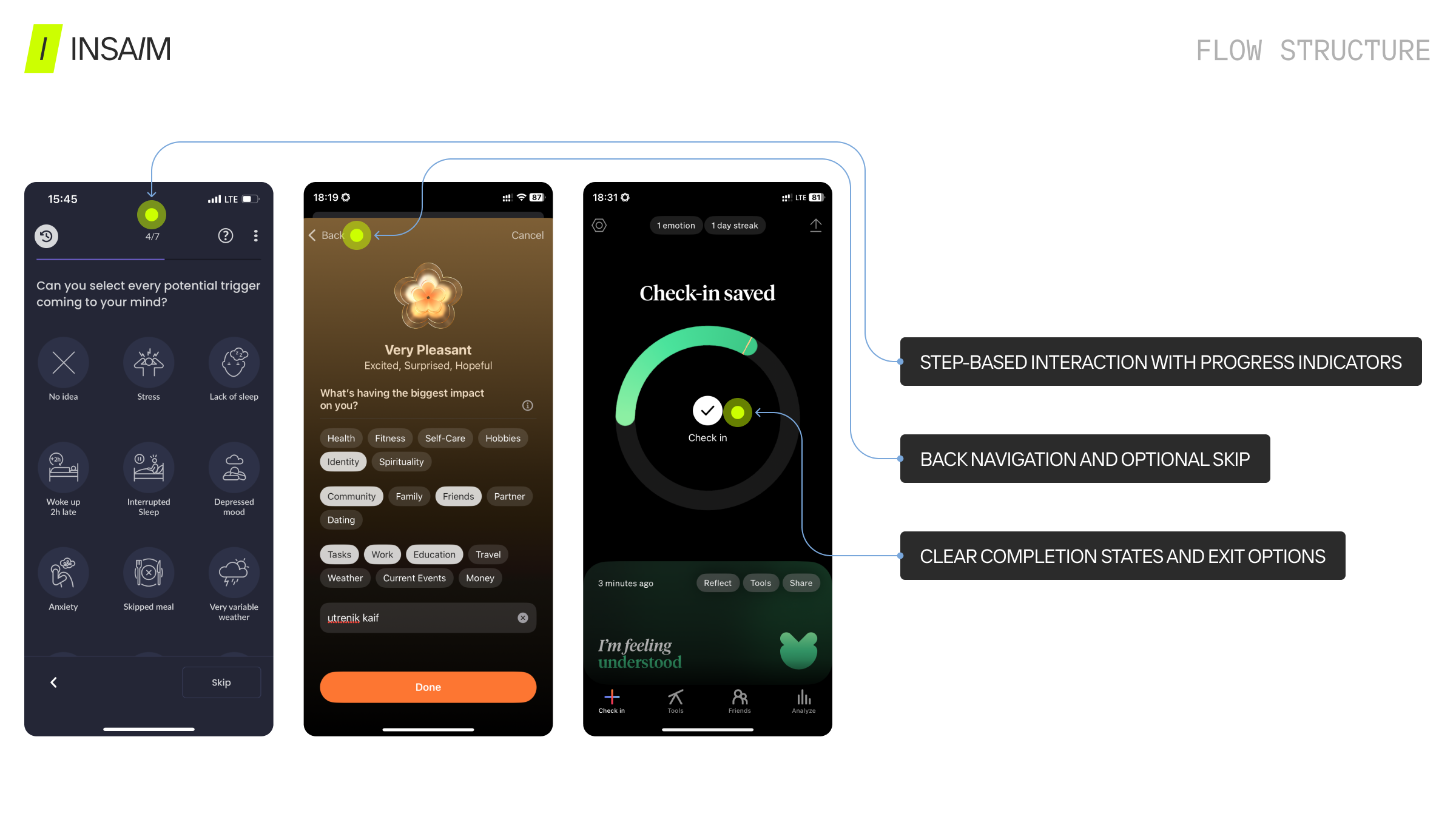
Flow Structure
- Step-based interaction with progress indicators
- Back navigation and optional skip
- Clear completion states and exit options
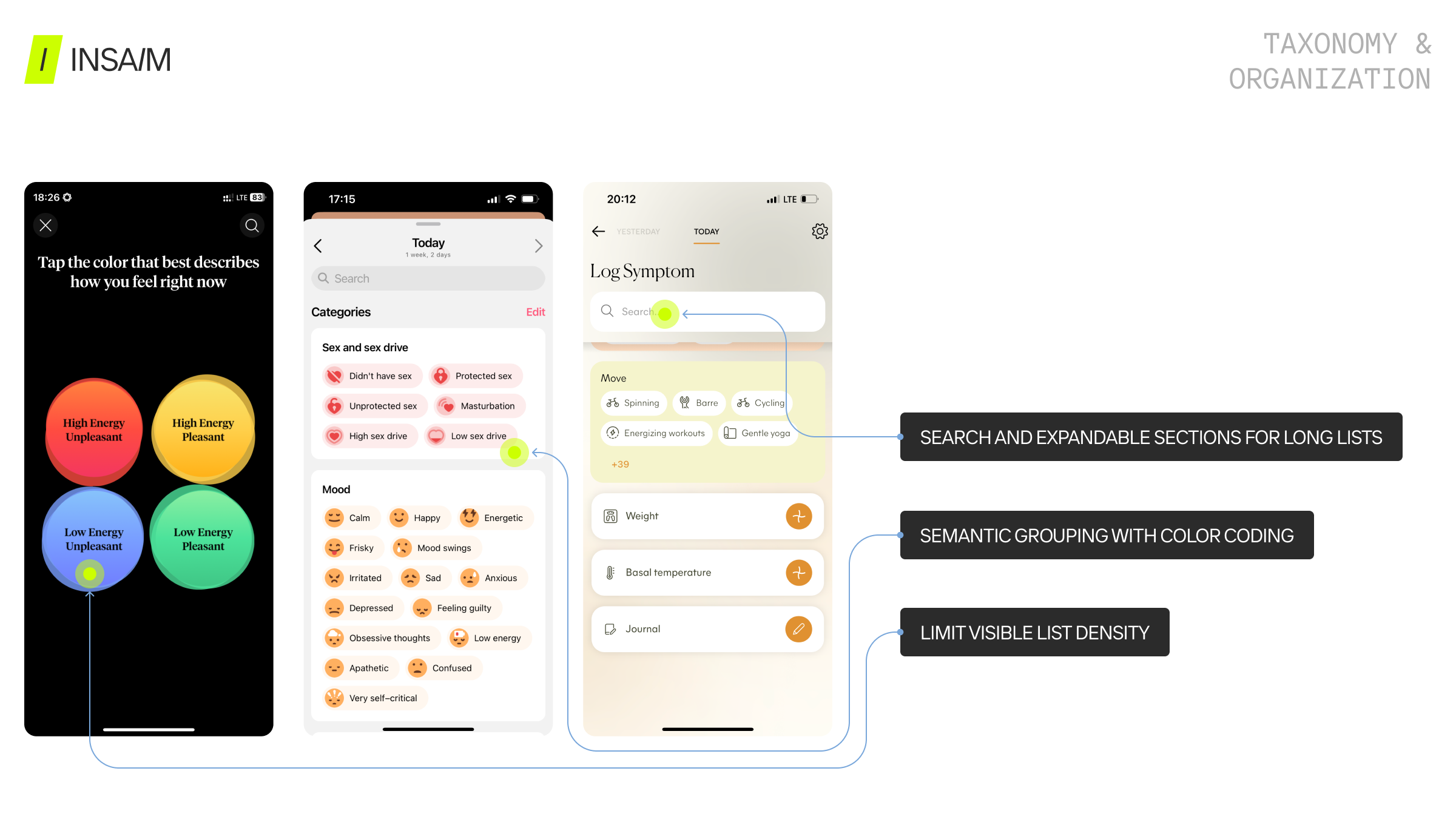
Taxonomy & Organization
- Semantic grouping with color coding
- Limit visible list density
- Search and expandable sections for long lists
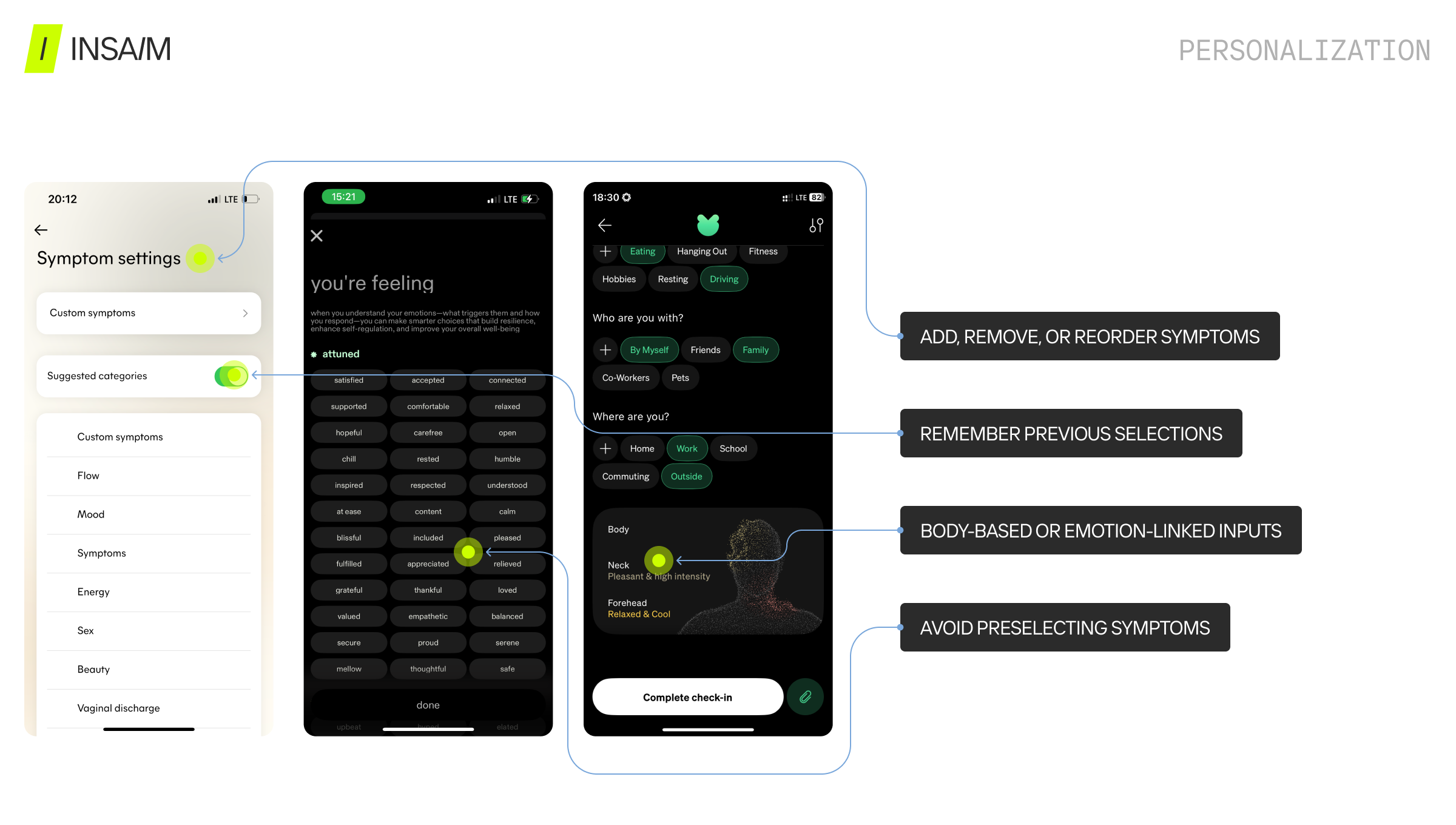
Personalization
- Add, remove, or reorder symptoms
- Body-based or emotion-linked inputs
- Avoid preselecting symptoms
- Remember previous selections
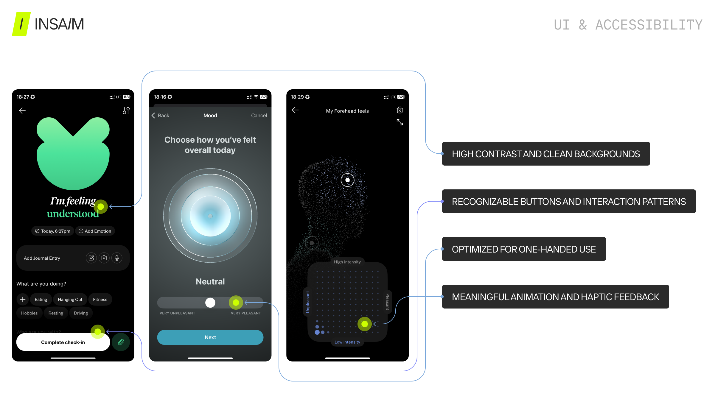
UI & Accessibility
- High contrast and clean backgrounds
- Recognizable buttons and interaction patterns
- Optimized for one-handed use
- Meaningful animation and haptic feedback
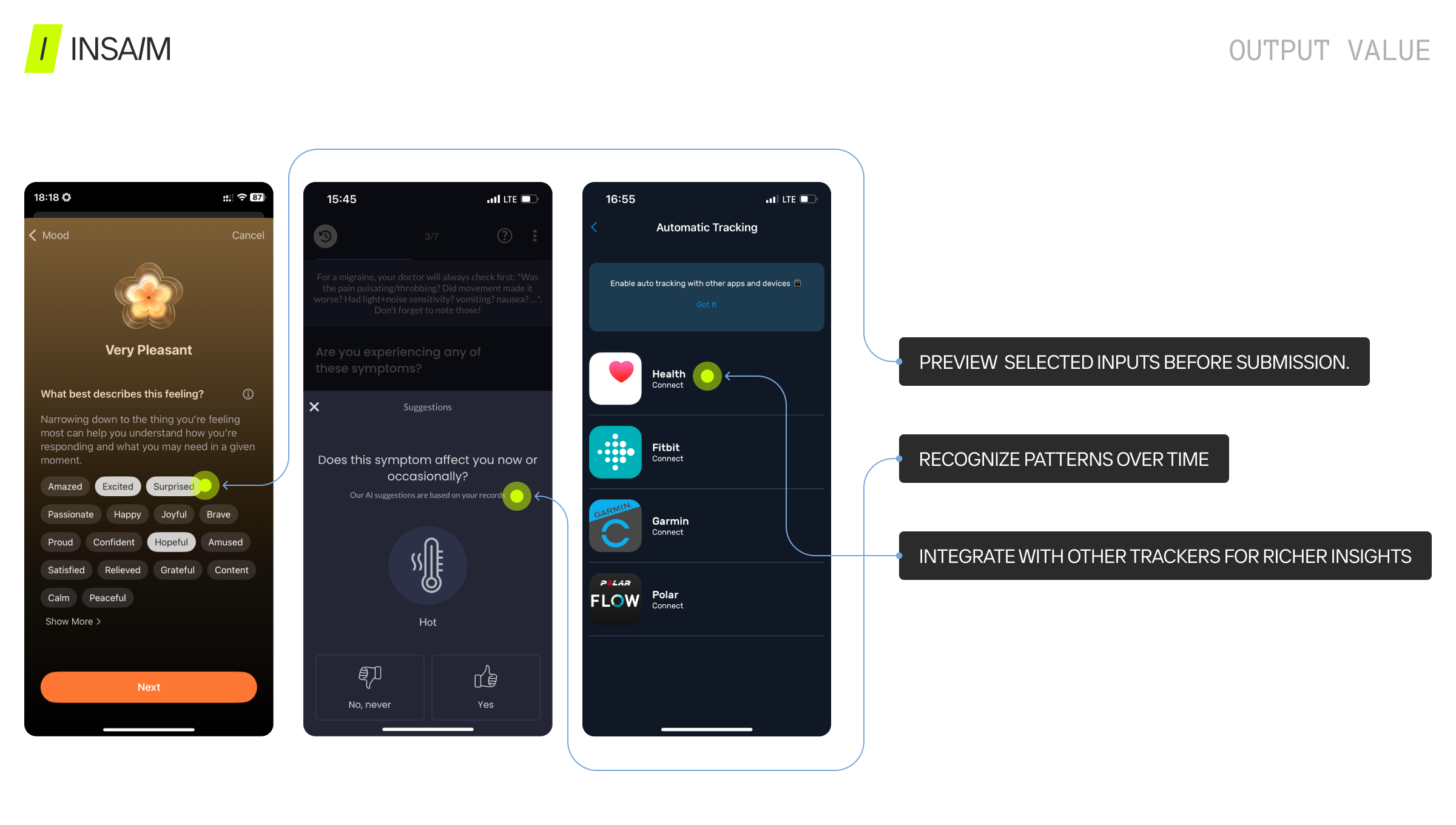
Output Value
- Preview selected inputs before submission
- Recognize patterns over time
- Integrate with other trackers for richer insights
Final Thoughts
The difference between a functional and the best symptom tracker app lies in behavioral UX/UI design. Successful symptom logging:
- Reduces effort and friction
- Supports emotional and cognitive reflection
- Provides clear control and visible progress
- Delivers insight and value from data
A great health tracker app design does not overwhelm users. Instead, it provides intuitive, actionable symptom logging flows that enhance engagement, personalization, and data quality.